WhatsApp has started to roll out a new design on both Android and iOS. This new design changes some design aspects of the app, while it also removed some color WhatsApp users are used to.
WhatsApp now has a new design on both Android & iOS
If you take a look at the image below, you’ll see a comparison between old and new design on Android. The company changed more than one UI element here, in fact, it revamped the home page.
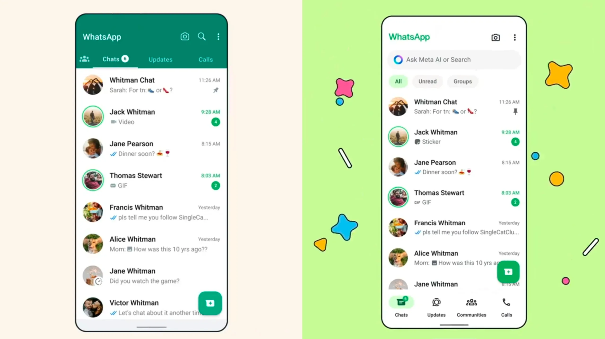
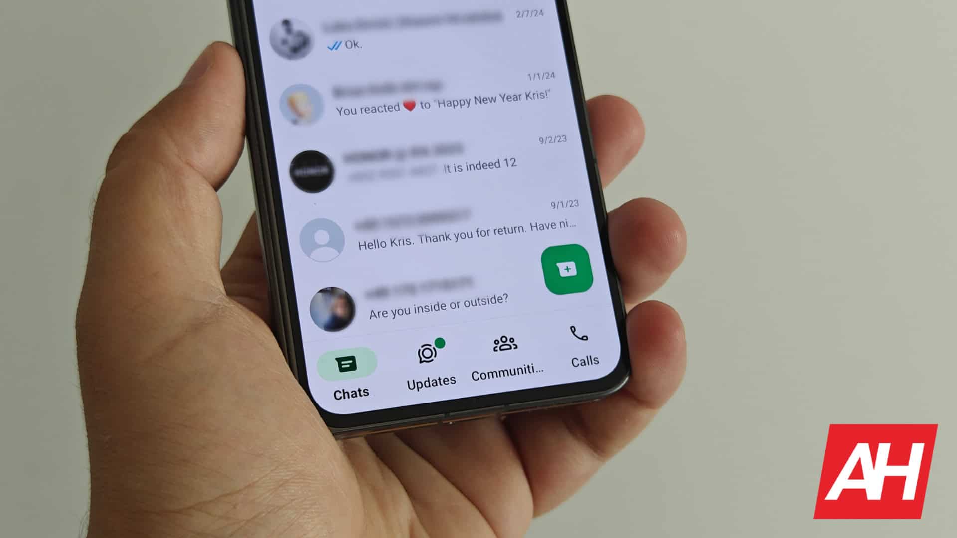
As you can see, there are no longer different tabs at the top, containing your Communities, Chats, Updates, and Calls. That has been relocated to the bottom of the screen, actually.
At the very bottom, you now get access to all of that, in a different order. The ‘Communities’ tab is now third in line, not first. This is arguably better positioning as it’s easier to reach. On the other hand, you could have easily swiped through different tabs before, and many people don’t really jump between them all that often, so… it all depends.
There’s also a new search bar in the mix
Meta also made the search bar more prominent. Instead of a magnifying glass icon in the top-right corner, you now get a full-fledged search bar below the WhatsApp name at the top. You can “Ask Meta AI or Search” thanks to that search bar. Do note that this change may not roll out to everyone, as I didn’t get it. I have everything else, but not that prominent search bar. The camera and additional options buttons are still located in the top-right corner.
Meta decided to make the app whiter than ever before
You’ll also notice that Meta removed the green color from the top. There was an entire section of the display at the top that had a green background, well, that’s no longer the case. Green accents are still present, though.
And last, but not least, you can now see different filters below the search bar. There are All, Unread, and Groups filters available there. That was not the case before, at all, anywhere on the screen.
This design may appeal to some, but we can see why the old one may suit some of you better. It remains to be seen how will the community react to this change.


