TL;DR
- Google prematurely published a blog about Material 3 Expressive.
- The new UI design is described as “the most-researched update to Google’s design system, ever.”
- Studies found that users were able to spot key UI elements four times faster than before.
It’s almost time for Google I/O 2025, which is scheduled to start on May 20. During this developer conference, it’s expected that we’ll hear about Android 16 for TV, Gemini integration with Android Auto and Android Automotive, Android XR, and more. While we should also learn more about Material 3 Expressive, it appears Google has spoiled its announcement by unintentionally publishing a blog that offers a deep dive into the topic.
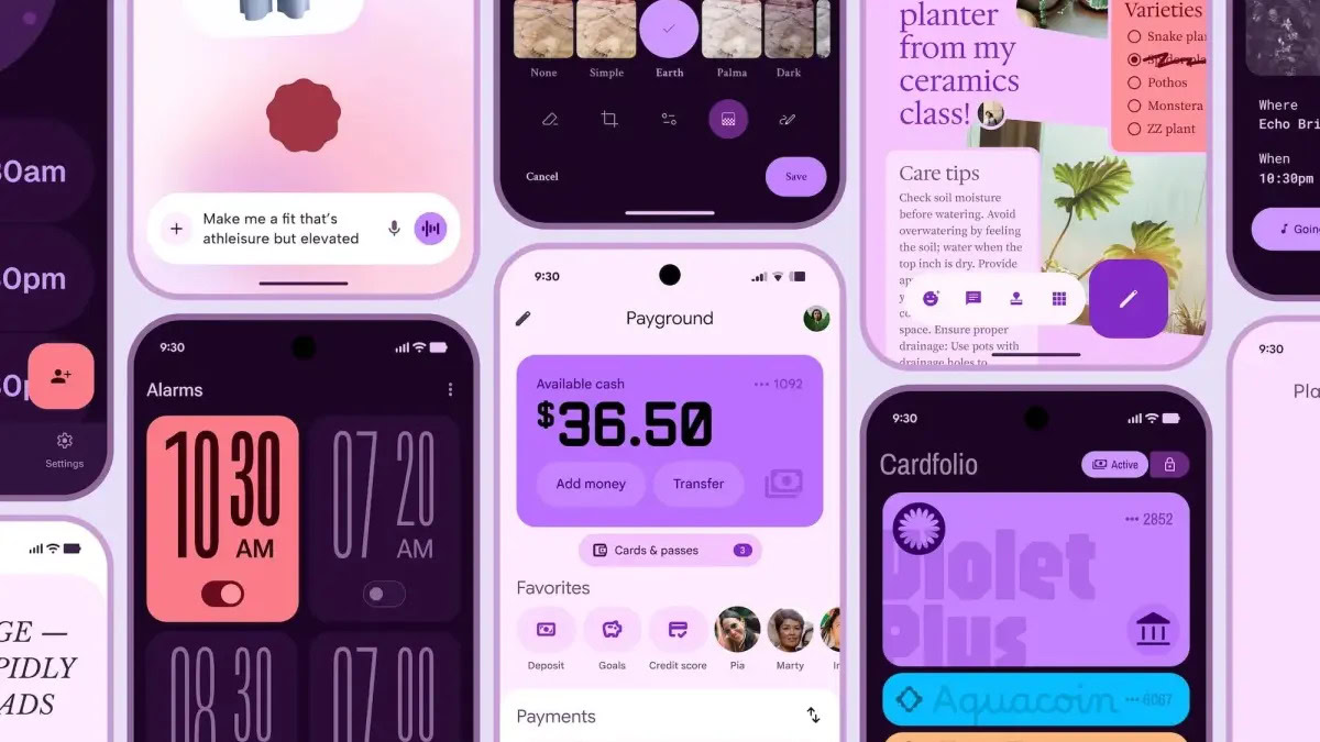
The Mountain View-based firm published a lengthy blog post, earlier than intended, explaining Material 3 Expressive (M3 Expressive). While the post is no longer up, it was saved by the Wayback Machine. The images can’t be seen in this version of the blog, but the folks over at 9to5Google were able to capture them.
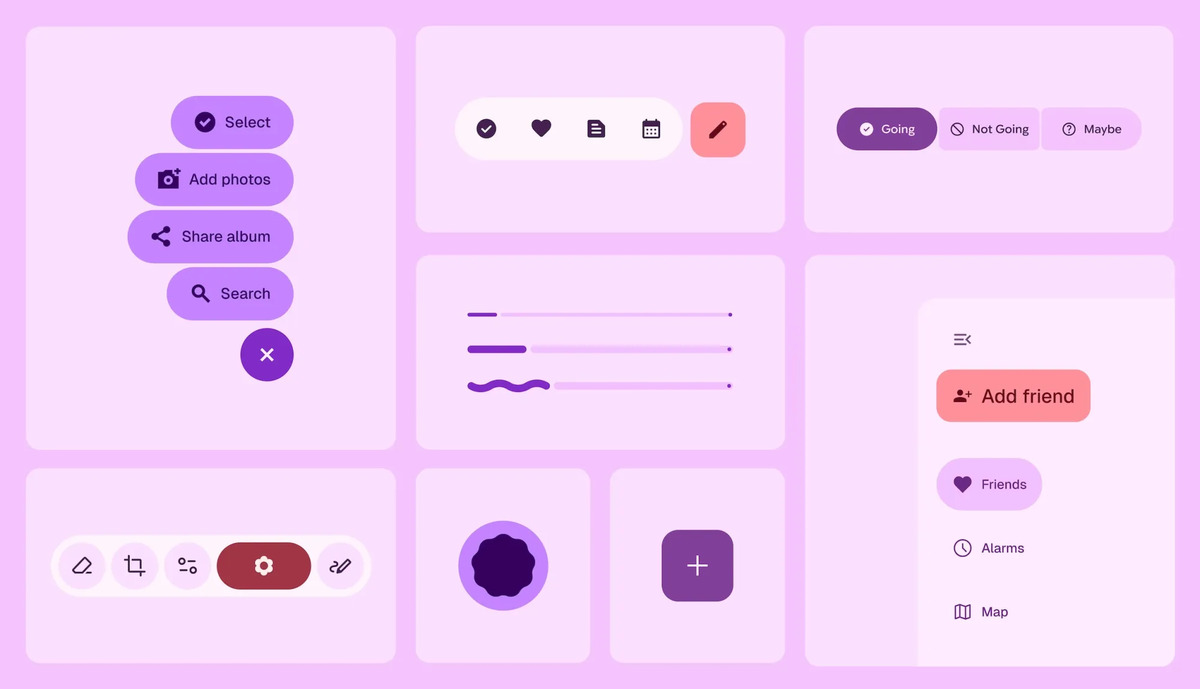
In this blog, the company explains that M3 Expressive is a design philosophy that “inspires emotion, communicates function, and helps users achieve their goals.” The “fundamental” parts of this design are “color, shape, size, motion, and containment.” These elements can be used to draw “attention to what matters in the interface.”
Google goes on to describe M3 Expressive as “the most-researched update to Google’s design system, ever.” It then elaborates on the decisions made and why the company felt the need to introduce this design change. According to Google:
Material 3 Expressive was born out of research—not in the 41 shades of blue kind of way, which delegated design decisions to data, but in a collaborative inquiry spanning research, design, and engineering. Back in 2022, our research intern was studying user sentiment of Material Design in Google apps. After mentioning her initial findings to colleagues in a Munich beer hall, she sparked a team-wide design debate: Why were all these apps looking so similar? So boring? Wasn’t there room to dial up the feeling?
These questions got the team thinking about the next evolution of Material Design. The tech giant states that it conducted “46 separate research studies with hundreds of designs, and more than 18,000 participants from around the world.” Some of these studies included:
- Eye tracking: Analyzing where users focused their attention
- Surveys and focus groups: Gauging emotional responses to different designs
- Experiments: Gathering sentiment and preferences
- Usability: Seeing how quickly participants could understand and use an interface
Through these studies, Google found that “participants were able to spot key UI elements up to 4x faster” when using M3 Expressive. To highlight this, Google shows a side-by-side comparison of Gmail’s current UI vs an M3 Expressive UI concept.
It’s not just about usability, however, as the firm says it discovered that expressive design can also impact someone’s perception of the product. Google says that M3 Expressive affected how “cool” people thought an app was. The company states:
Specifically, we found a 32% increase in subculture perception, which indicates that expressive design makes a brand feel more relevant and “in-the-know.” We also saw a 34% boost in modernity, making a brand feel fresh and forward-thinking. On top of that, there was a 30% jump in rebelliousness, suggesting that expressive design positions a brand as a bold and innovative leader, willing to break from convention.
It also found that this new design seems to work well for people of all ages and that it’s preferred “over non-expressive design that followed the iOS Human Interface Guidelines.” According to Google, M3 Expressive was able to help “45+ year old users perform on par with their younger counterparts.”
We actually got a little taste of this new UI experience in an early look last month. In this sneak peek, we saw notable changes to Quick Settings and other areas.


