Nothing has strongly indicated that it’s getting rid of its distinctive Glyph Interface for its smartphones, and I for one would be fully behind such a move.
The British tech startup, run by OnePlus co-founder Carl Pei, took to X (formerly Twitter) recently with a characteristically pithy statement.
It reads: “We killed the Glyph Interface”, and is accompanied by a little animation of the company’s lighting system breathing its last.
A light for drawing attention
This statement seems to suggest that ahead of the launch of its next flagship phone, the Nothing Phone (3), Nothing has done away with the gimmick that essentially set it apart in its early years.
When the Nothing Phone (1) landed in July of 2022, the main talking point – alongside this being Pei’s first post-OnePlus product – was the elaborate lighting system on the back of the phone.
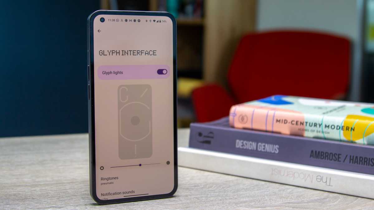
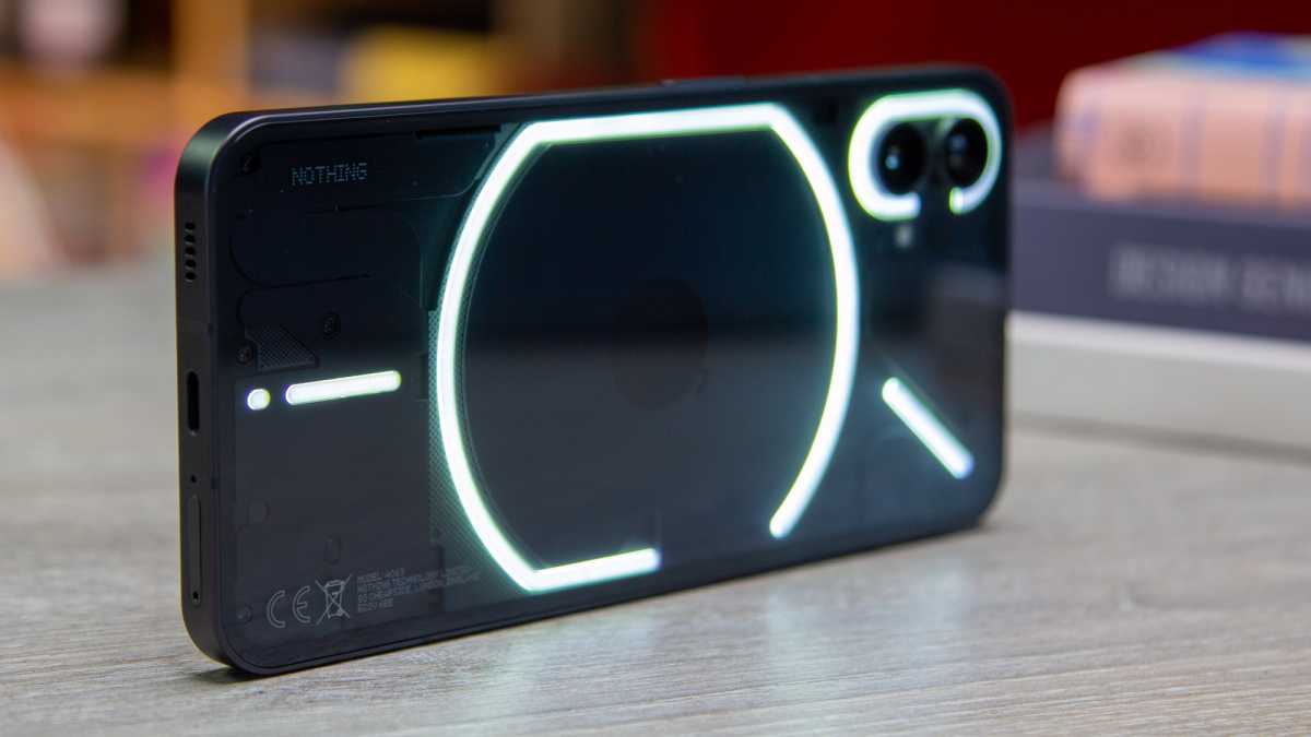
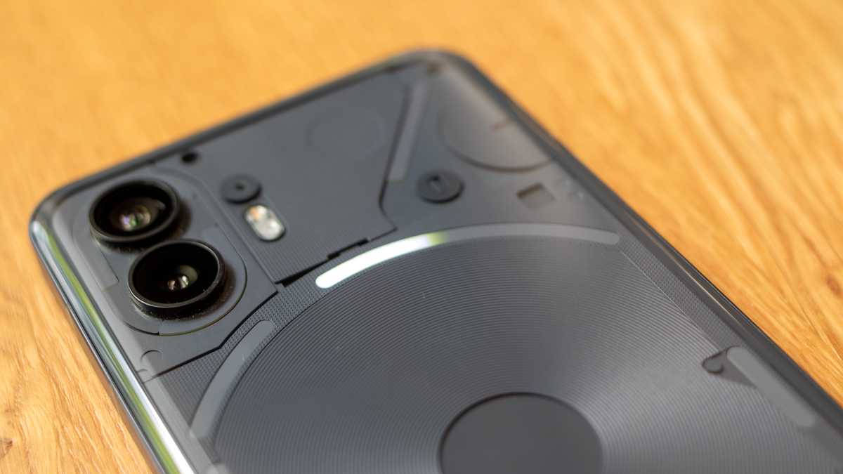
The Glyph UI was composed of a unique pattern of white LED strips dotted around the semi-transparent rear of the phone. These were talked up as being more than mere cosmetic frippery, and would flash in time with ringtones and notifications.
They could also illuminate to indicate charging progress and serves as a fill light, among other things.
Dominic Preston / Foundry
Glyph us a break
With the Glyph Interface going the way of pressure-sensitive screens and unibody metal designs, Nothing would appear to be losing a vital distinguishing point for its phone.
Except, I don’t think that it has. I’d argue that the Glyph Interface has served its main purpose: drawing attention to a small startup tech company in its precarious early years.
Without a suitably mammoth marketing budget, it’s an incredibly difficult ask to compete with giant companies like Samsung and Apple. Nothing still isn’t on that level, but it now has a foothold in the market and a certain amount of brand awareness.
Several hardware iterations down the line, it’s now ready to release its first true flagship phone, and the quality can largely speak for itself.
Dominic Preston / Foundry
What is it for?
Personally speaking, I never adopted the Glyph Interface into my day to day use beyond the testing phase. As someone who is wholly averse to screen protectors, and who routinely runs their phone in silent or vibrate mode, I never lay my phones face-down.
This means that I rarely look at the back of my phone, rendering an elaborate rear-mounted notification system more or less pointless.
With the screen always facing towards me – as it should be – I can tell when I’m being called through the screen lighting up or a vibration sound. When I want to set a timer, I adopt the classic measure of using the preinstalled Clock app.
I recognise that these sound like statements of the bleeding obvious, but that just serves to illustrate my point. Nothing’s Glyph Interface was always a cool gimmick in search of a purpose, and it never truly found one.
Henry Burrell / Foundry
Next to Nothing
Some reports have suggested that it might be producing a customisable dot matrix display to replace the Glyph Interface, which sounds like swapping one unused gimmick for another. I’m more interested in the suggestion that this will be Nothing’s most sophisticated and advanced phone yet.
Other recent reports suggest that will be the Nothing Phone (3), and the latest news suggests that it’ll come in black and white, that pricing will start at $799, and that specs will include 12 or 16GB of RAM and either 256GB or 512GB of storage.
None of which is remotely surprising, and all of which drives home the company’s claim that this is going to be Nothing’s first proper flagship phone.
Just to be clear, this isn’t a criticism of Nothing. Quite the opposite in fact.
I’m excited to see what’s next from Nothing, even if it’s a little more subdued in nature. The company’s design work is on point, its phones always offer excellent value, its custom Android UI is better than most, and the Nothing aesthetic is strong enough to stand on its own two feet without any flashy lights to distract.


