Robert Triggs / Android Authority
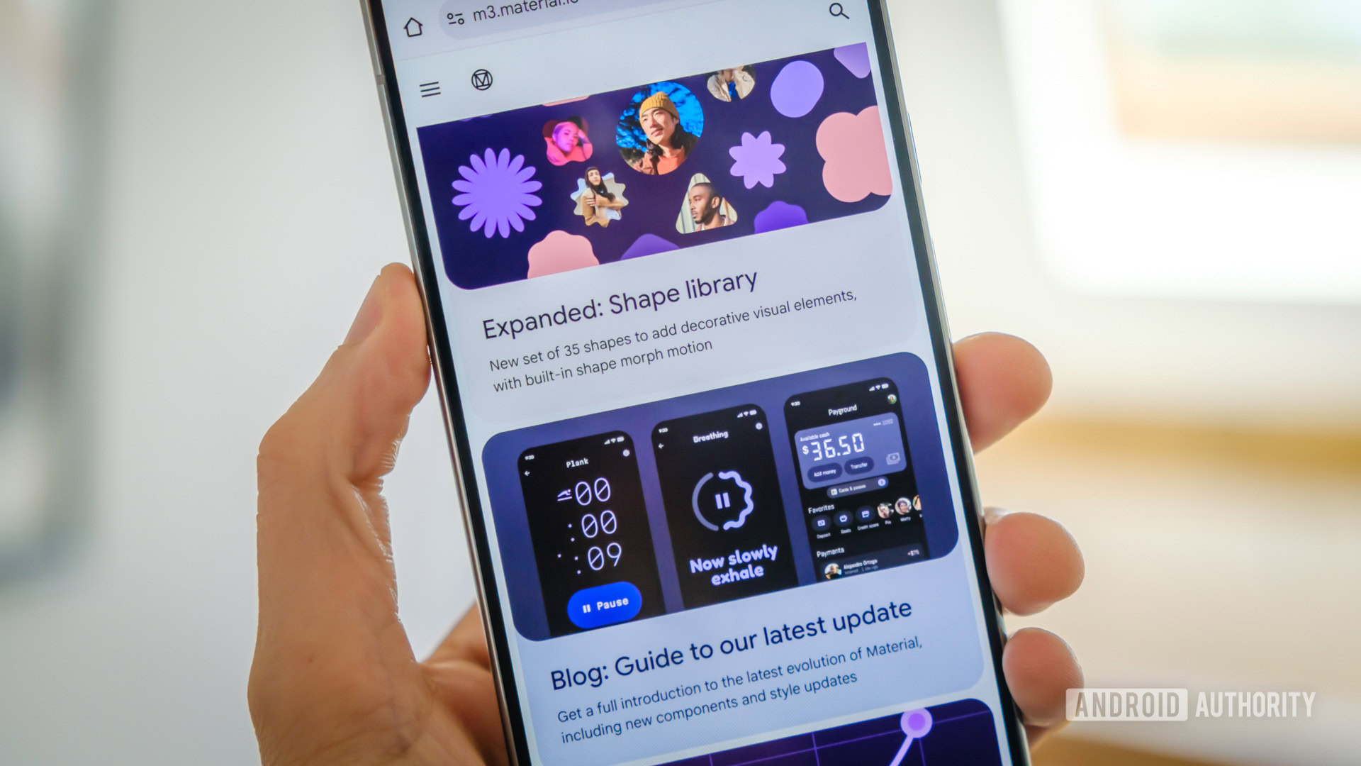
During The Android Show, Google officially lifted the curtain on Material 3 Expressive, the next step in design aesthetics for Android 16. The new look is just a part of Google’s initiative to make both Android and Wear OS playful and visually engaging, and even invoke emotions while you use it.
For context, the last big design change with Android was about four years ago with Android 12 and Material You. With Material 3 Expressive, it builds on the Material Design foundation and extends upon the original design philosophy. Google also poured a lot of research into this refresh, as it is the result of 46 global studies, hundreds of design variations, and took into account the insights of over 18,000 participants.
But did all this research work? Well, we asked readers what they thought, and so far, it looks like it’s certainly paying off.
What do you think of Google’s Material 3 Expressive design for Android?
We originally polled readers on their initial impressions on May 13, and we already received over 5,800 votes (and counting!) in just a matter of days. It’s pretty clear that many people are excited about Material 3 Expressive.
So far, a whopping 56% answered that they’re loving it and welcome the changes. About 36% said they will make up their mind after they use it first, and only 8% voted that they like the current design and don’t want the changes.
Though Google has announced Material 3 Expressive and we’ve seen a few hints of it in Android 16 Beta 4, don’t expect to see it immediately once Android 16 goes public in June. Google plans to introduce Material 3 Expressive first on Pixel devices, which also includes the Pixel Watch. For other OEMs, it will roll out after the Pixel, and we can expect Material 3 Expressive design elements intertwined with the other brands’ custom Android skins.
There’s a lot of new stuff coming in Material 3 Expressive. Some of these new changes include better animations and motion physics, dynamic and personalized color themes, updated typography, new shapes for app icons and other interface elements, and more. System UI aspects are also improved, like the new Quick Settings panel, more blurring effects throughout, and even Live Updates.
But it’s not all good news. Reader geraldgrow notes that the parts of Material Design that utilize translucent, thin lines, and low contrast text can be hard to see for older people who have difficulty seeing. It’s important to make sure that users are still able to control the thickness and contrast for accessibility purposes. Other readers, like gacorek11 and mannyg3rd, aren’t big on the new fonts or colors, respectively.
For the most part, however, it looks like Material 3 Expressive is resonating well with our readers and fans. We only got a glimpse of what’s to come, but if you have a Pixel phone, tablet, or watch, it’s coming sooner rather than later.

