Aamir Siddiqui / Android Authority
TL;DR
- Google is testing two new user interface designs for its Circle to Search feature on Android.
- One new UI places all search options in a rectangular box, while another uses a two-row layout.
- It’s unclear which design Google will ultimately release to the public, although the two-row layout appears to be rolling out more widely.
Circle to Search has been a fantastic addition to Android flagships. It’s one of those smaller features that slowly but surely changes how you use your phone. By making it fundamentally simpler to search, it encourages curiosity for even the smallest of questions. Google is keen to grow Circle to Search, so the company keeps testing new additions and UIs. We’ve now spotted two new UIs for Circle to Search, one even rolling out in the stable branch.
An APK teardown helps predict features that may arrive on a service in the future based on work-in-progress code. However, it is possible that such predicted features may not make it to a public release.
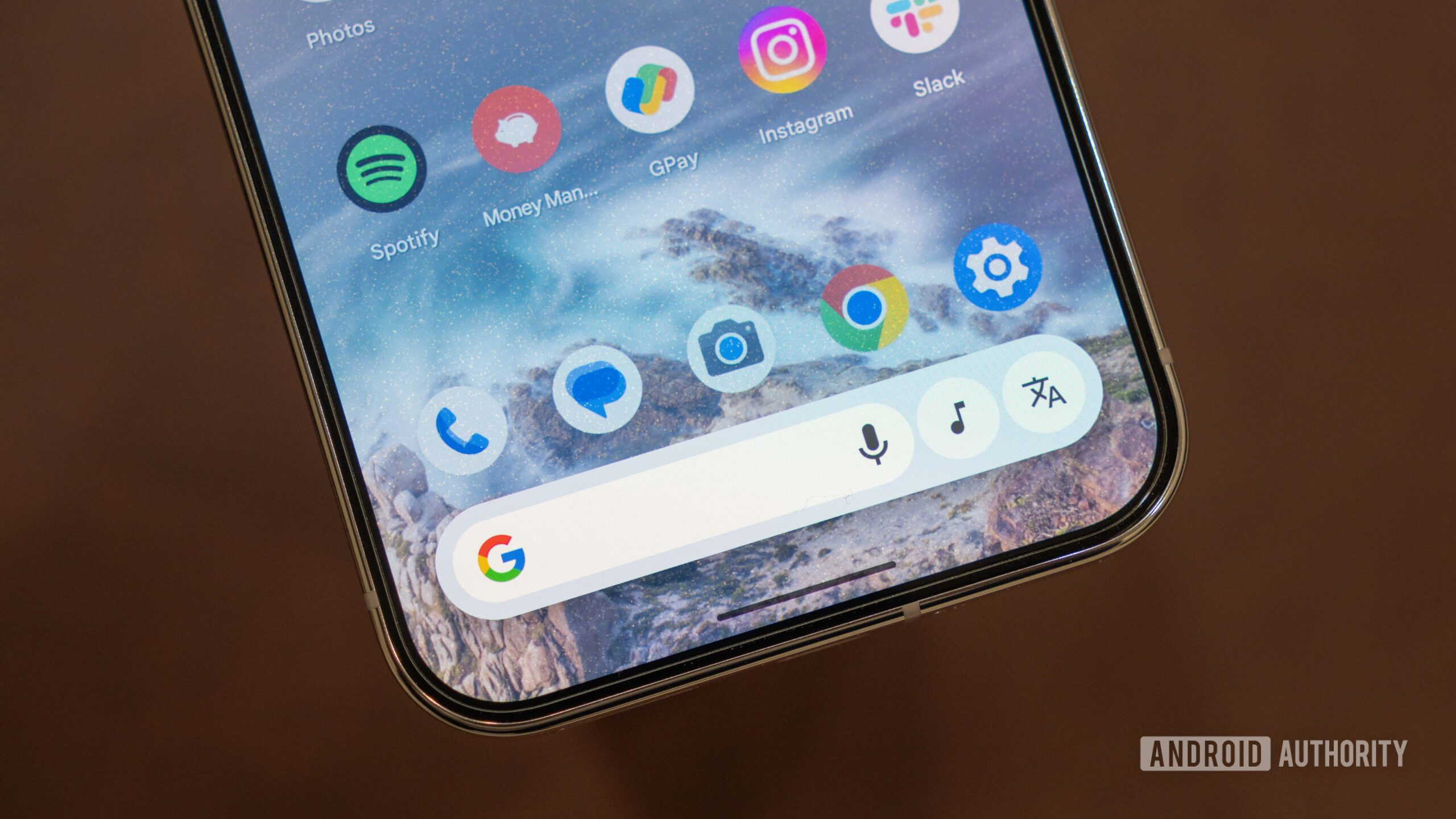
The usual Circle to Search UI has a long bar with tightly rounded corners. Within this bar lives the Google Search bar with an icon for voice search. There are also individual buttons for Song Search and Translate, giving it a neat look.

Aamir Siddiqui / Android Authority
Current UI for Circle to Search
With Google app v16.17.38, Google is testing a couple of new UIs for Circle to Search.
Telegram user @brokenthrone received a new UI for Circle to Search. This new UI gets rid of the long bar and houses everything in a rectangular box with rounded corners. There are no buttons or separators within, just icons and icon text. The Google Search bar is replaced with a Search icon and text, and similarly, we see icons and text for Song Search and Translate.
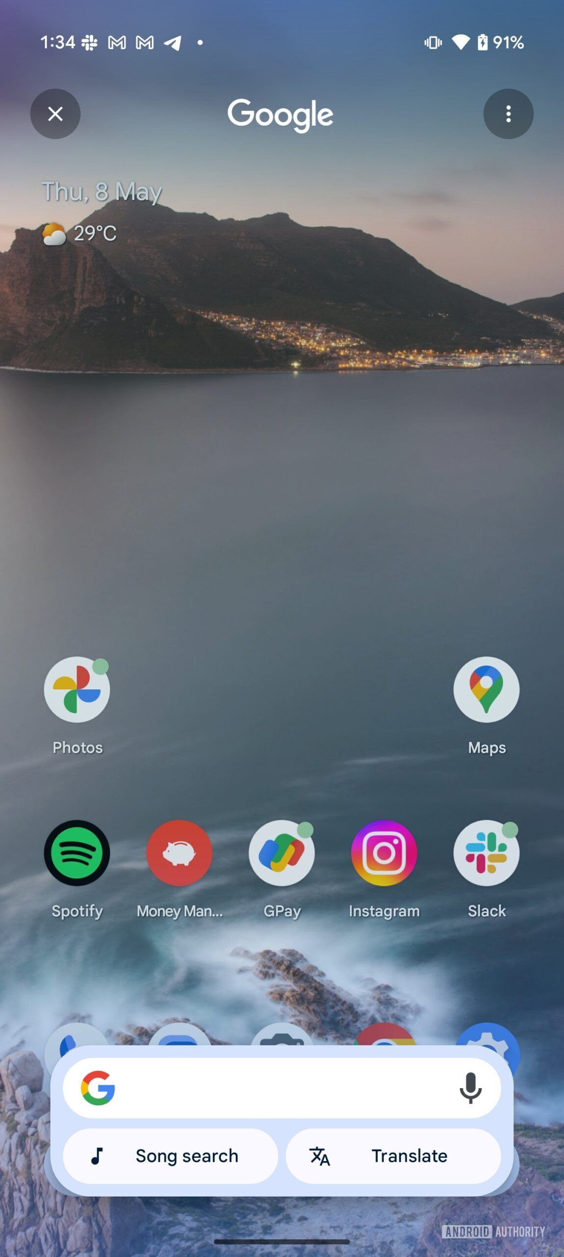
As spotted by Telegram user @username5662, there’s another UI in testing. We’ve received the same UI on our Pixel 9 Pro XL, so there’s a chance that this UI is being widely rolled out. This UI adopts a two-row design, with the Google Search bar occupying the top row and the Song Search and Translate buttons sitting in the second row.
Aamir Siddiqui / Android Authority
It remains to be seen which design Google will eventually settle on. Which of the three UIs do you like more? Let us know in the comments below!


