Aamir Siddiqui / Android Authority
TL;DR
- Google is testing two interfaces for the incoming call screen in the Phone app.
- Users may be able to choose between a pill-based horizontal swipe UI or an iPhone-like single-tap UI for answering/declining calls.
- However, users may not have the choice to retain the current vertical swipe UI, which is a shame.
Google has been testing a redesign of the Phone app for a while now, primarily focusing on how users answer or decline calls. Back in September 2024, we spotted Google working to abandon the swipe actions for incoming calls in favor of dedicated accept and decline buttons, similar to the iPhone. More recently, in March 2025, we spotted Google testing yet another new pill-based UI for left-right swipe gestures. Google doesn’t seem to have made up its mind on which UI to go with, and that’s great for users, as it seems it could give them a choice between the two. Interestingly, this choice could co-exist alongside the Phone app’s Material 3 Expressive redesign.
An APK teardown helps predict features that may arrive on a service in the future based on work-in-progress code. However, it is possible that such predicted features may not make it to a public release.
In the latest Phone by Google app v177.0.763181107 beta release, strings indicate that users can choose between the horizontal swipe gesture and the single-tap buttons on the incoming call screen.
Code
answer_method_preference_list_key
Incoming call gesture
Horizontal swipe
Single tap
While we couldn’t activate the current iteration of the new UIs right away, we have previously seen both of them.
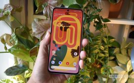
For a recap, this is what the current incoming call UI looks like in the Google Phone app:
For incoming calls, you get a single button, which you can swipe up to answer the call or swipe down to reject the call.
The upcoming single-tap button layout for the incoming call UI will possibly look like this:
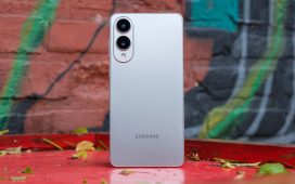
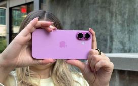
This layout is similar to the incoming calls UI on the Phone app on iPhones currently on iOS 18, but OEMs like Samsung swap the button position on Galaxy phones running One UI. You can see both in the images below:
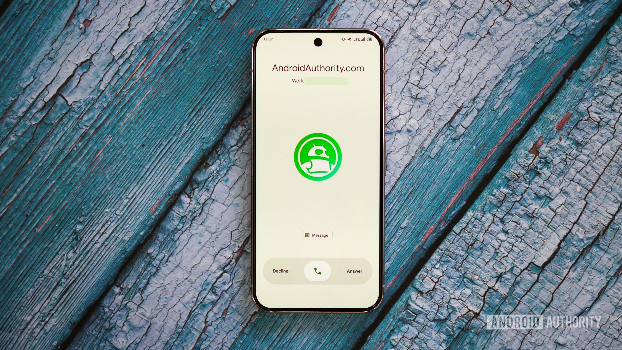
The second choice that users could get is this pill-based UI for the left and right swipe gestures:
When the call arrives, the Decline text is colored red and the Answer text is colored green, while the phone button in the centre animates to showcase a phone ring. The text changes to black color in a second once the animation is done, but the colors can be transitioned back into once again when you swipe right to answer the call or swipe left to reject the call. You can see the animation in this video below:
Either option will require retraining muscle memory for Google Phone app users, though users switching from iPhone to Android will welcome the iPhone-like single-tap UI. Since Google seems to be giving users the choice, nothing is stopping the company from keeping the existing vertical swipe and offering it as a choice, too. We hope the company considers this if it indeed is going ahead with the incoming call UI refresh. We don’t know if Google will do so, and we’ll keep you updated when we learn more.


