Recently, several details about Material 3 Expressive have been leaked. This will be a new evolutionary step in Android’s design language. Google is already redesigning its apps using the new guidelines. A leak has revealed what the Google Clock app will look like with the Material 3 Expressive-based redesign.
The Telegram account Mystic Leaks has shared images of the Google Clock redesign. The same source had previously shared images of Android 16, which lends a fair level of reliability to this leak.
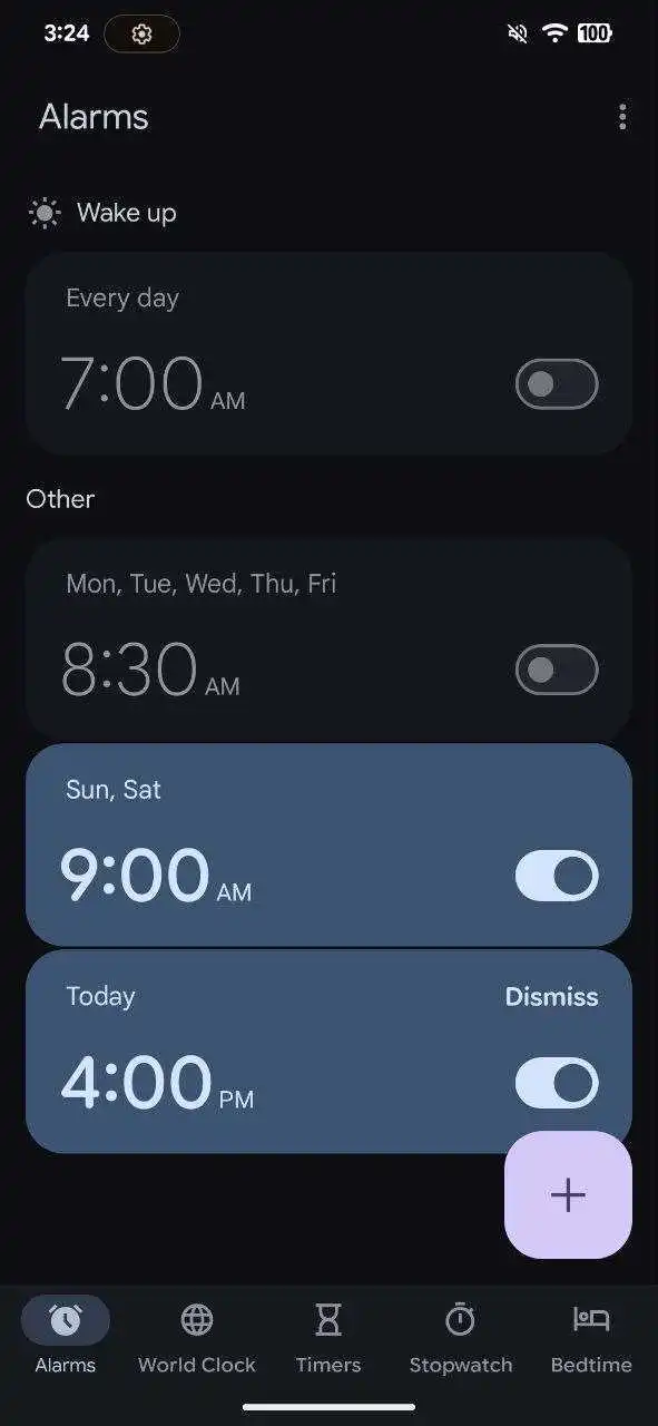
Material 3 Expressive-based Google Clock app
If we take a look at the images, we’ll notice tweaks to virtually all the tabs. The bottom navigation has also been modified, starting with a slightly shorter indicator (that kind of “pill” that lets you know the section you are in). Additionally, the “Clock” and “Timer” tabs will be renamed “World Clock” and “Timers.” This change appears to more accurately reflect their functionality. After all, the app allows you to check the time in multiple countries simultaneously and set multiple timers at once.
Starting with the “Alarms” tab, the overview remains similar to the current one. The main difference is the circular button with the “+” sign, which is now located in the lower right corner and takes on a square shape (previously it was centered and round).
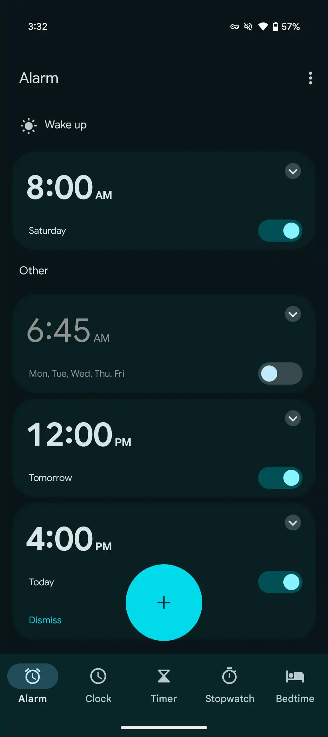
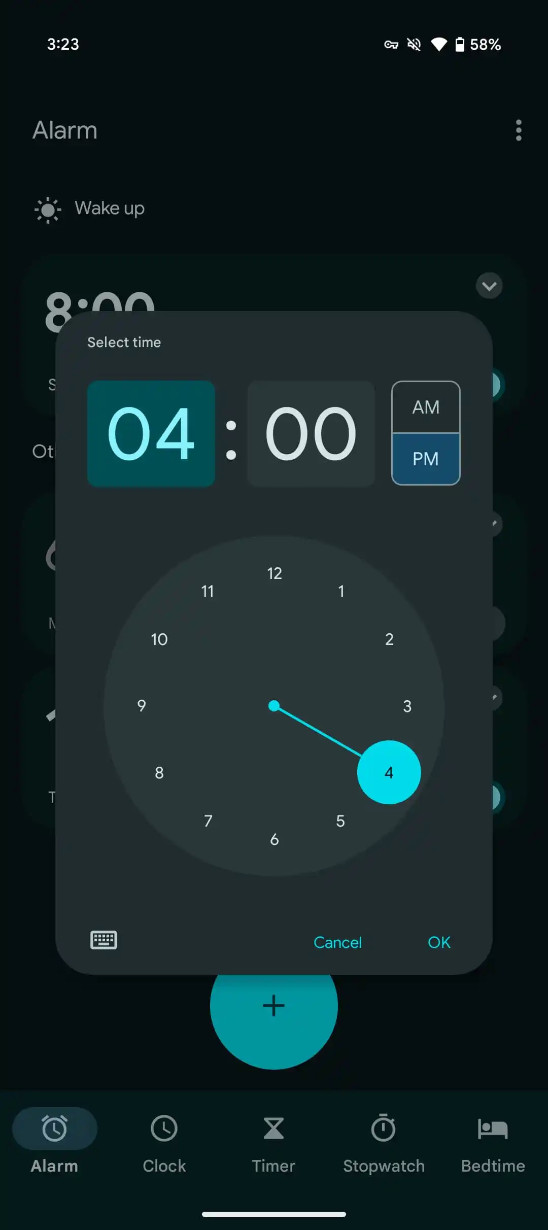
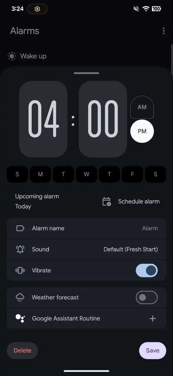
However, the user interface changes drastically when opening the details of an alarm. The time is displayed with vertically “narrowed” numbers, and the buttons to select “AM” and “PM” have different shapes: a vertical “half” pill and a circle, respectively. An interesting new feature is the inclusion of the days of the week just below the time, which will speed up configuration. All the options previously found on the expanded alarm menu (the one that appeared after tapping on the “down arrow” button from each alarm) are present here.
Moving to the “Timer” tab, we see the numbers again with that “narrow” vertical style. The UI undergoes a radical change, with a giant “Start” button replacing the previous smaller circular “Play” one. Additionally, the new interface includes shortcuts to timer presets and allows you to directly name each timer.
The “Stopwatch” tab also features striking changes. Large icons take the stage, replacing the small circular icons we were familiar with. It seems Google wants to make the function of each button clear at first glance.
As for the “Bedtime” tab, the changes are the most subtle. The user interface remains largely unchanged, with the exception of the circular buttons, which are now pills with descriptive text.


An updated design language dominated by big buttons
Unfortunately, there are no images of the World Clock tab available. However, this overall redesign of the Google Clock app gives us a pretty clear idea of the foundations of Material 3 Expressive. Large icons with descriptive text will take center stage, along with those “floating pills.” Google will also play with the shapes of both icons and fonts to achieve an interface that, as the name suggests, is much more “expressive.” We’ll be keeping an eye on Google I/O 2025 for all the details of this revamp.


