We have already seen some instances of this new UI that Google is working on for Android, and now it looks like it’s much more than just a revamped Quick Settings panel.
Thanks to Mishaal Rahman and Android Authority, we can see what the redesign will actually look like. It’s based on the new Material 3 Expressive theme that is expected to be announced at Google I/O next month.
This is a pretty big redesign for Android, to be quite honest. And one that we haven’t seen since the introduction of Material Design over 10 years ago at Google I/O 2014 and debuted on Android 5 Lollipop. While we’ve seen redesigns since then, it’s mostly been refinements of the initial Material Design. Whereas this time around, everything is changing.
This comes at a rather interesting time, as Apple is rumored to be redesigning its mobile OS this year as well. With a lot of the same elements that Android will be getting.
More blur, fewer bubbles
Rahman has shared screenshots of what the design changes will look like, and so far it looks like Google has not missed a single aspect of the OS.
Starting with the lockscreen, which is getting a pretty subtle change. Google is moving the date and weather information below the time that is centered on the display. And the contextual information will sit at the top when there’s no notifications present. And it will move to below the clock when notifications appear.


There is also a new optional setting for the compact notification shelf, which will collapse notifications on the lockscreen. It will only show the icon, similar to Samsung’s default settings on One UI. Even the PIN entry page is getting a slight redesign. Instead of a white or black background, it’s more of a translucent look. So you’d be able to sorta see your wallpaper in the background. Everything is a bit more “bold” this time around. From the numbers to the text.


A few years ago, Google went all-in on making various aspects of the UI more bubbly. Specifically the volume sliders. These are now going to be less bubbly, and more like a squircle. Where the sides are flat, but the corners are slightly rounded, sort of like the corners on the display of the phone. The volume slider that appears on the side of the screen also has this same look now.
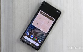
Quick Settings gets a much needed overhaul
The Quick Settings panel is also getting a much needed overhaul this time around. Though, not quite as overhauled as we’d like. The layout is similar, but with more blur now. It actually looks like a mix of One UI and Pixel Experience now. At the top is still the large brightness slider, with the large rectangular toggles. What’s interesting here is that the toggles are more oval when turned off, and then when turned on, they are more like a squircle. A slight visual tweak that many might not even notice.


Unfortunately, Google is still keeping the Settings, Profile icon, and Power button at the very bottom of the display, forcing you to swipe down twice to get to Settings.
With the notifications, we’re seeing some changes here too. Under the notifications, there is a larger “Clear All” button, with a button on the left to jump into Notification History, and one on the right to adjust your modes. Turn off notification sounds, vibrate, etc.
The Settings app gets a splash of color
Rahman had already shared the new Settings app in an earlier leak, but now we’re able to see a bit more of the changes. On the main screen of the Settings app, you’ll see the same spacing as you currently do, between different sections. But each section is going to be color-coded. It’s not much, and appears not to be tied to the wallpaper colors on your device. But it does add a splash of color to the Settings.
When you jump into a specific setting section, you will see more changes here. There’s now more boxes here, with additional space between items. This does appear to show fewer options on screen, versus the old style. But it does provide a much nicer looking settings page.
And that’s not all, there’s plenty of other changes too, including a new battery and charging icon, new status bar icons, clock fonts and more.
We are unsure when this would rollout, as it is not available in the latest Android 16 Beta, which is currently the latest beta for Android 16. So it’s unlikely to be coming at I/O next month. And it’s also unlikely to be part of a QPR release. So we’re expecting this to launch with Android 17 next year, if not later on.


