Joe Maring / Android Authority
TL;DR
- Android 16 QPR1 Beta 1 revamps the recents screen, making the app context menu for actions like split-screen more discoverable with a new pill-shaped button.
- This button now displays the app’s name and a downward arrow, a common indicator for additional menus, helping users find previously hidden options.
- Other visual changes include pill-shaped containers for “Screenshot” and “Select” buttons and a blurred wallpaper background aligning with Material 3 Expressive.
If you’re new to Android, figuring out how to put two apps in split-screen mode might not be intuitive. This is because the button for split-screen is often hidden in a context menu many users may not realize exists. To access this menu, you need to press and hold an app’s icon in the recents screen—a gesture that lacks a clear visual cue. This discoverability challenge might be why Google has adjusted the recents screen in the latest Android 16 beta.
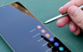
In today’s Android 16 QPR1 Beta 1 release, Google has made a subtle but significant change to the recents screen, making the context menu for each app more discoverable. Previously, only the app’s icon appeared above its task. Now, the recents screen displays the app’s icon, its name, and a downward-pointing arrow within a small pill-shaped button overlaid on the task.
Displaying the app’s name is a welcome clarification, clearly identifying which app corresponds to each task preview. The most impactful change, however, is the addition of the downward arrow. This icon is widely understood to indicate an additional menu, so its presence should help more users realize they can access further actions directly from the recents screen.
In Android 16 QPR1 Beta 1, the recents screen’s context menu offers seven primary actions: “App info,” “Split screen,” “Pin,” “Pause app,” “Screenshot,” “Select,” and “Close.” An eighth action, “Save app pair,” appears exclusively when the context menu is accessed for a split-screen task. While dedicated “Screenshot” and “Select” buttons (for text or images) also remain below the task, these have been a standard feature on Pixel devices for several years.
Beyond the new pill indicator, Android 16 QPR1 Beta 1 introduces other subtle visual refinements to the recents screen. The dedicated “Screenshot” and “Select” buttons are now also enclosed in pill-shaped containers, creating a more consistent look. Furthermore, the previously solid gray background has been replaced. Now, a blurred version of the user’s wallpaper or underlying content subtly shows through, a visual effect aligning with Google’s new Material 3 Expressive theme. For a look at all the other design updates we’ve found in Android 16 QPR1 Beta 1, check out this article.

