Robert Triggs / Android Authority
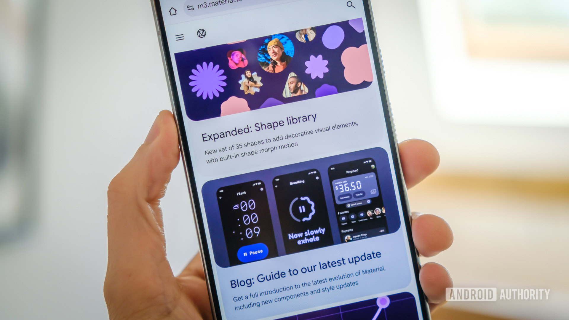
Material 3 Expressive is pretty — I get it. It’s fluid, responsive, and has all the fun and eye-catching animations that I want from a modern interface when I look at my phone. But as Google explained all the work that went into making this gorgeous new design, as well as the process of updating all of its own apps to match it, my mind kept wandering to one thought: But why? Why waste time fixing what isn’t broken instead of adding useful features we’ve wanted for years?
I guess I’m getting a bit jaded after following the mobile industry for nearly two decades now. But when I see a splashy new design, I don’t think, “wow, pretty,” I just go through a mental list of every functional improvement and bug fix I’d rather have instead. Give me proper enhancements and features that’ll make my everyday life easier instead of spending countless hours designing and developing a fresh coat of paint for what is already a modern interface.
So here is a list of 10 features I’d have loved to have instead of Material 3 Expressive on my Android phone. I’d be doing victory laps in my backyard if any of these were implemented in lieu of switching bottom tabs to a floating tab bar, and no, I can’t believe I had to write those last few words.
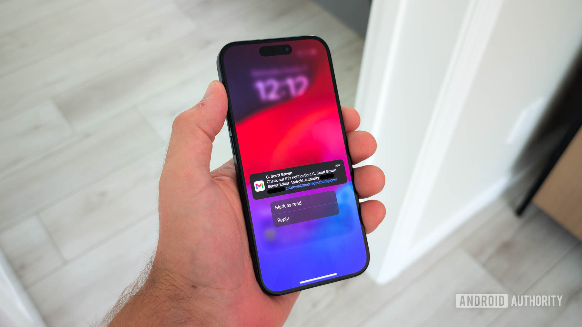
Mark as read in Gmail’s notification
C. Scott Brown / Android Authority
Insert long, interminable sigh.
Do I need to explain this? Gmail on Android pops up a notification for a new email, you check it, and you’re done with it without needing to open the full email. It’d be good to just tap “Mark as read” right there, right? You can do it in Gmail’s app on iOS, but not on Android. No, Android gets Delete/Archive and Reply. I can’t believe we must use third-party apps to bring something so basic to our phones.
Easier way to enter events in Calendar
Every time I open Google Calendar on my phone or on the web to enter a new event, I start typing something like “dinner tomorrow at 8pm,” only to realize that Google doesn’t process natural language. No, instead, I have to tap to select the date and time separately and adjust them manually.
It’s infuriating, especially when third-party task and calendar apps already offer this; Samsung Calendar (middle screenshot above), Todoist (left screenshot), Tick Tick, and Business Calendar 2, to name a few, can all do it. Why not Google Calendar then?
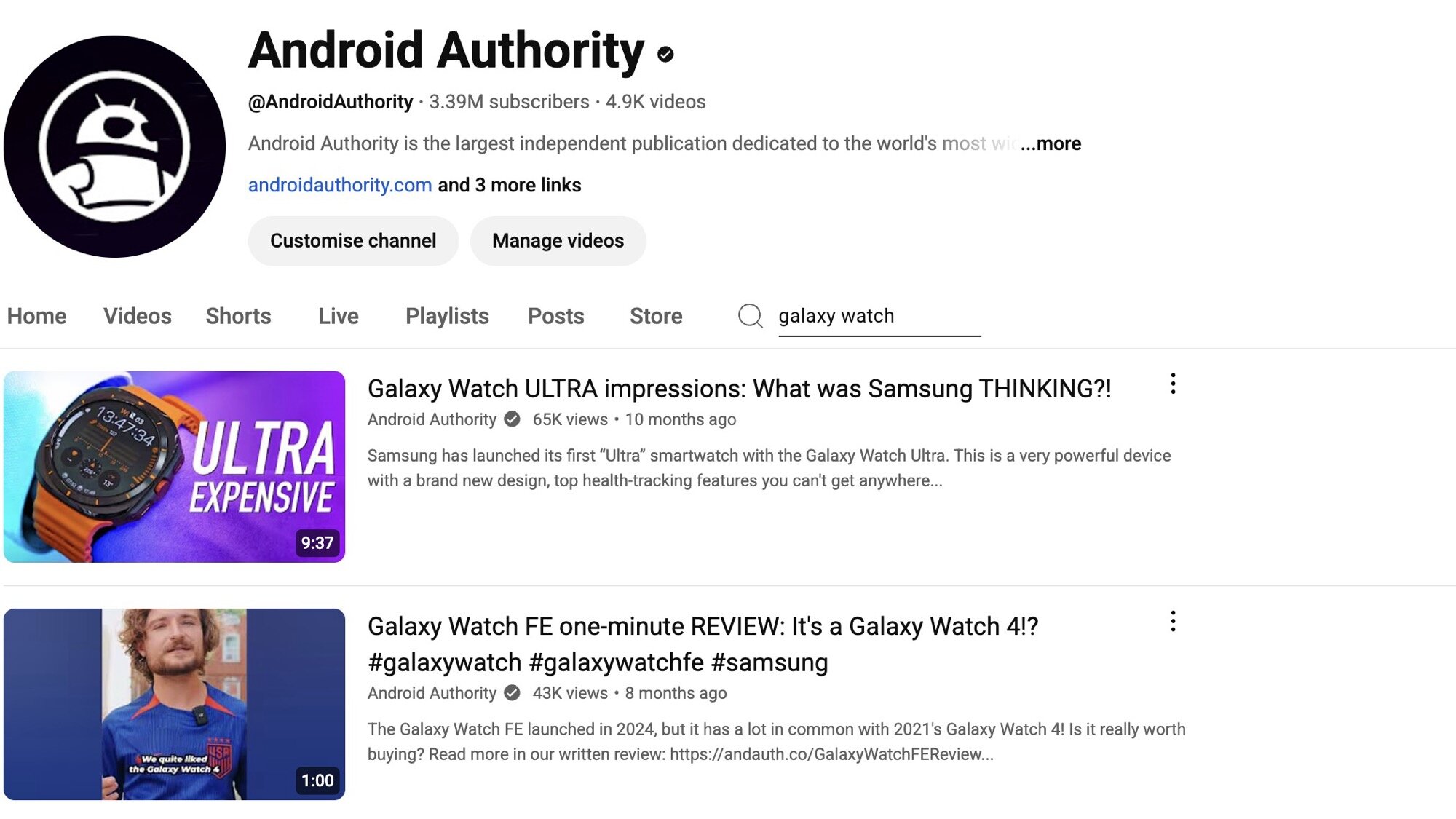
Searching for videos inside a YouTube channel
Rita El Khoury / Android Authority
Screenshot
Not all YouTube channels and videos are created equal. Oftentimes, when I’m looking for a product recommendation or review, I have a list of go-to channels that I want to check first because I trust them. On the web, I can easily open a YouTube channel’s page and search its videos. So if I’m looking for a new robot mower in France, I can see if Avis Express has reviewed any, and if I want a new pair of exercise buds, I can check what SoundGuys recommend. Or, you know, I can check our own Android Authority channel for the latest smartwatch or phone reviews.
Unfortunately, this isn’t a feature of YouTube on mobile. No, instead, we get 20 new gesture changes per year, a redesigned pop-up player, more Shorts on our home screens, 500 redesigns of the comment section, but no searching inside a channel. Or, as we’ve recently asked for them, no block channel option and no way to organize subscriptions by folders.
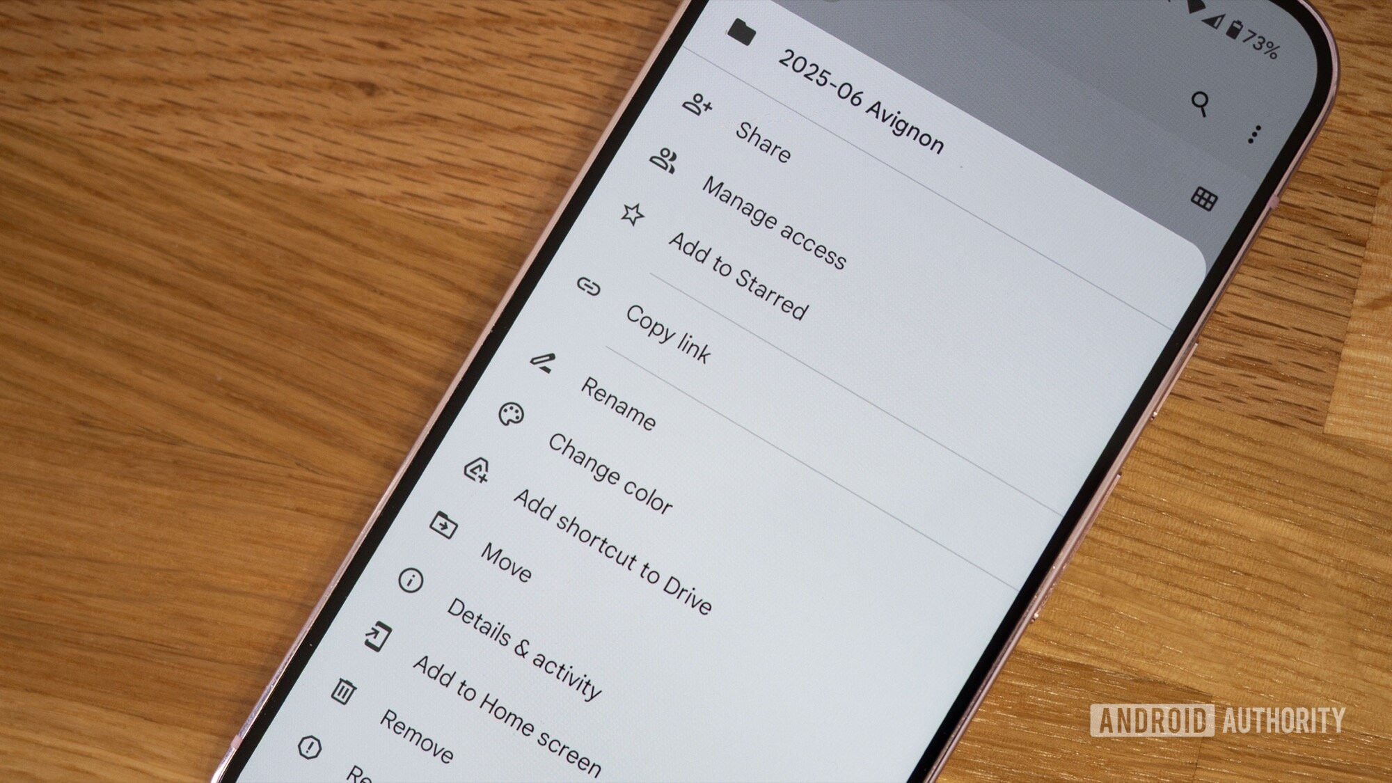
Make an entire folder available offline in Drive
Rita El Khoury / Android Authority
When I plan a trip, I throw all the reservation documents in one folder on Google Drive. My plane/train tickets, hotel confirmation, car rental if needed, and all the activities I’ve booked for the trip. When the time comes to actually take said trip, I have to go and download all of these one by one on my phone to make sure I can access them in case my internet abandons me.
You can both download individual files and make them available offline, but the option isn’t there for folders. At least not on mobile. I’m sure the company that built Gemini can figure out a way to download a whole folder instead of single files.
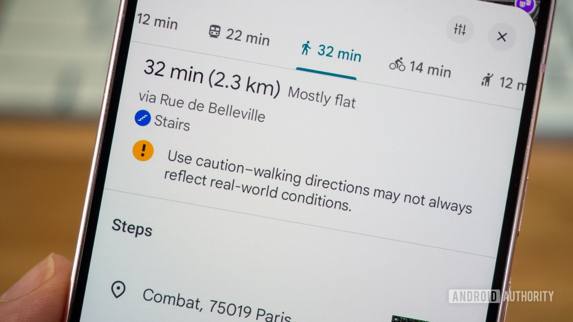
Proper elevation information for walking directions in Google Maps
Rita El Khoury / Android Authority
A 10-minute walk on flat terrain is not the same as an uphill trek through Ménilmontant, Google. (“Montant” means rising, it’s literally in the name.) So when I ask for walking directions in Maps, I’d very much like to know what that walk will entail. Even if it’s just a minor altitude difference, I, an asthmatic person, want to know that. I’m sure older people, pregnant women, and those with mobility issues would love to know this, too. Instead, all I’ve ever seen in Maps is a “mostly flat” description, even when there’s a clear notice of stairs. But am I going up the stairs or down them, Google? No idea.
I’m tired of looking at Street View to try to guess the street’s elevation angle for some of my walks. And heaven forbid I use mixed directions, like transit + walking — just forget about it! It could be a 20-minute uphill trek after my metro stop, and Maps will not warn me. No, I have to individually search for the walk beforehand to ensure it won’t be a battle.
I could write books about everything else that annoys me in Google Maps, like the fact that I can’t add multiple stops when using transit, or look up a place’s rating while walking by (I have to end navigation to look at a place’s details then search for my directions again!), or that some directions are absolutely silly (check the three screenshots above) unless I pay attention and notice there’s a shorter way, but I’ll just shut up for now.
Bluetooth support for Find My Device’s Bluetooth trackers
Rita El Khoury / Android Authority
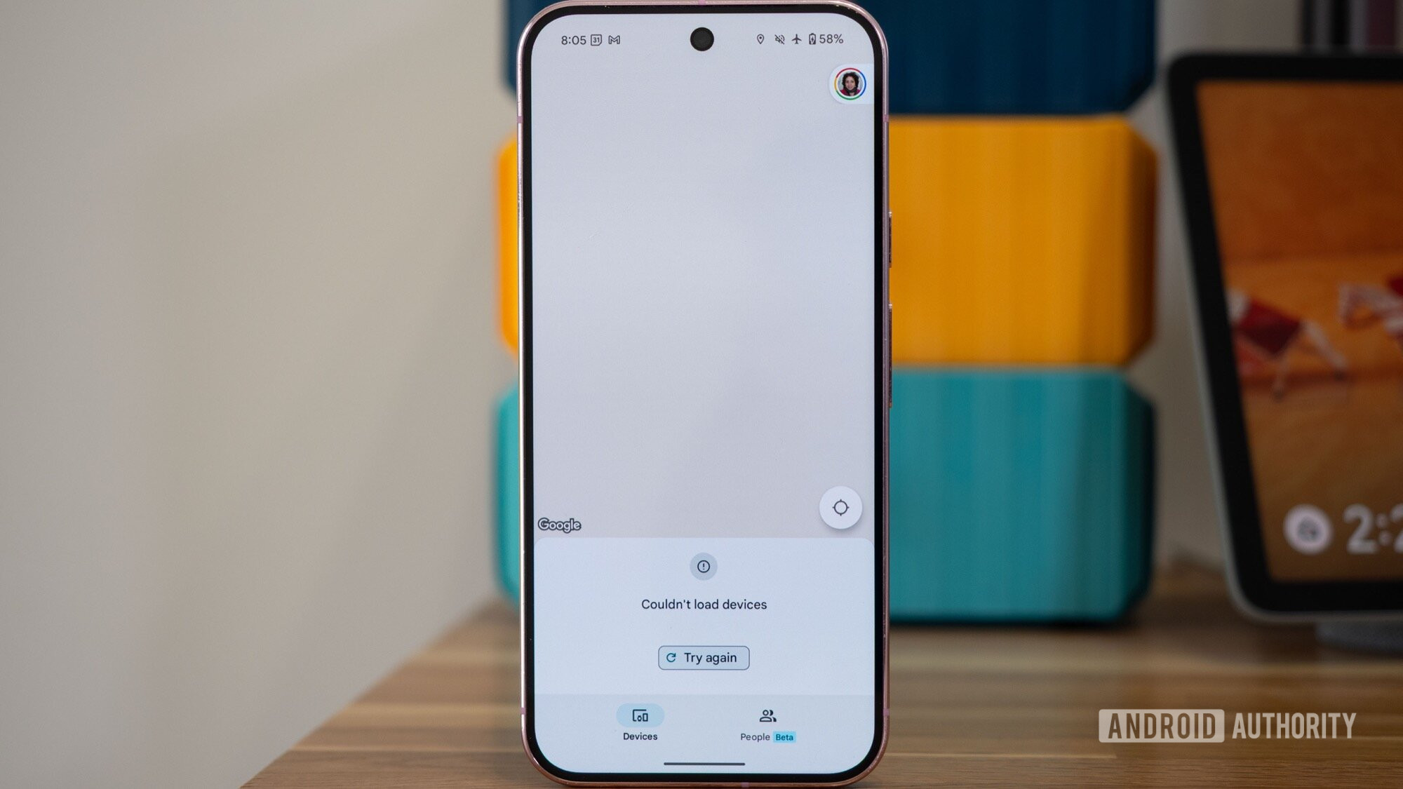
Look, I know how silly this sounds, but I swear it’s true. If you have a Google-compatible Find My Device tracker, you can’t actually track or find the thing over Bluetooth only. The entire Find My Device app — now Find Hub — doesn’t load if you are offline or in Airplane mode, making nearby tracking and locating useless if you’re traveling or in an area with a bad cell signal.
This is a problem with every tracker I’ve tested — Moto Tag, Chipolo POP, Pebblebee trackers, you name it. On the other hand, Samsung’s Galaxy Smarttag 2 can be located over Bluetooth when your phone is offline, and so can Tile trackers and AirTags on iPhones. The next time I lose my wallet in a foreign airport, I’m sure I’d appreciate being able to find it more than I’d appreciate the nifty animation that opens to a blank Find Hub app screen.
Better routines in Google Home
Can someone explain to me why the Home and Away routines in Google Home can only control lights? They can’t set my thermostats to away mode, start my robot vacuum, turn the TV off, or lock my door.
Even custom routines are so limited (unless you want to dabble in the code creator to write your own routine). For example, even though my SwitchBot air purifier surfaces various modes in the Home app, I can only set it to turn on/off with routines; I can’t easily pick the mode it goes into. So I resorted to using a written voice command to do that. Why not surface all the available commands and variables in the routine picker? I don’t know.
More basic customization of the Pixel Launcher
Rita El Khoury / Android Authority
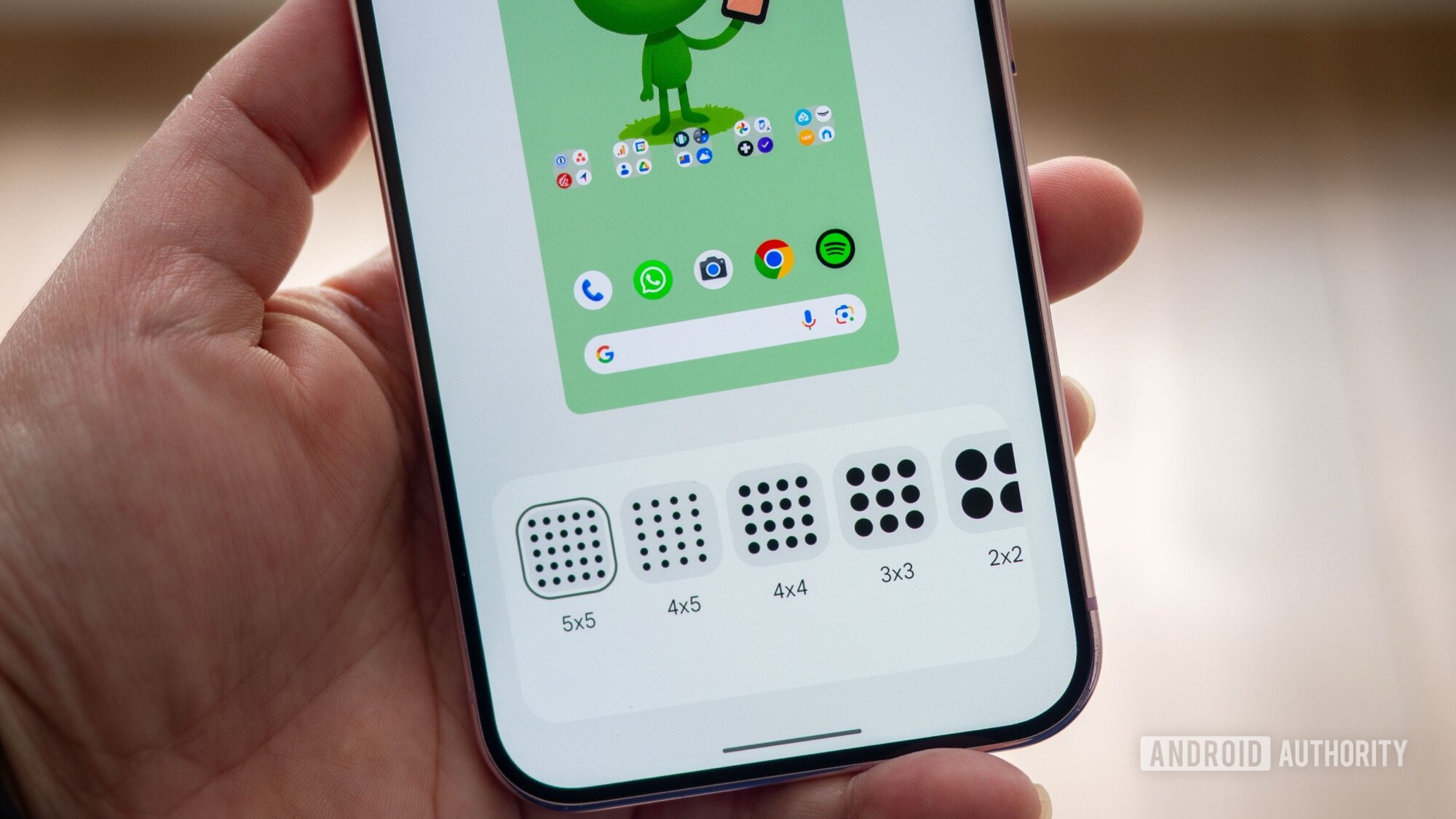
My colleague Andy Walker did a better job of explaining the basic features missing from Pixel Launcher, but for me, it comes down to a few essentials. Let me move/resize the Google Search and At A Glance widgets, give me more grid size options because 5×5 on a large display is not enough, and let me stack widgets. Those three additions alone would take the Pixel Launcher to new heights for me, but if I just had to pick one, I’d give everything for a 6×5 app grid. Just that. Nothing fancy.
This long list of Google Photos improvements
Rita El Khoury / Android Authority
I tried to narrow down my Photos wishlist to just one significant change, but the reality is that I’d like the app to add a bunch of minor but functional improvements throughout.
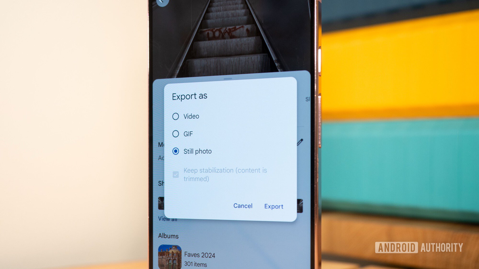
I’d love to be able to download multiple photos to my phone instead of doing so one by one, just like I’d love to batch export Motion Photos to still pics and delete the originals to save storage space. I want to change the grid size in albums to view a higher density of photos, and for the love of everything, I’d love to see a search filter that narrows down photo stacks so I can browse similar pics and quickly trim down my gallery.
Any of these improvements would make my daily use of Google Photos more efficient. A new floating bottom bar won’t.
Per-app volume controls
This would let me keep Chrome silenced forever, but turn on Spotify and YouTube’s volumes to 70%, while keeping WhatsApp’s volume to 50% to properly hear my mom’s voice messages — all without ever finagling with the volume buttons each time I go into or out of an app.
Bonus: Just stop moving things around
Jimmy Westenberg / Android Authority
With every new Android version, I have to field a list of questions from my family members and friends akin to, “Why did this change?” or, “Where did this go?”
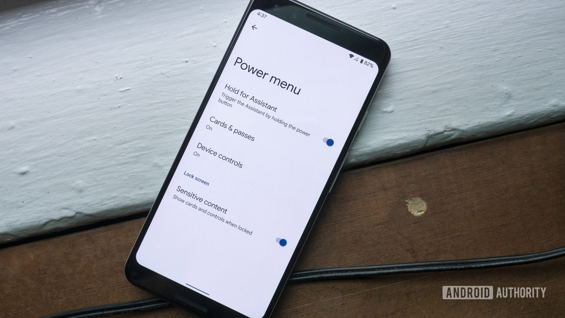
I don’t know, Mom; I don’t know why the power button no longer turns off the phone or why the Wi-Fi and data quick settings toggles are now bundled into one that a simple tap can’t turn off. I don’t know why Memories and the Sharing tab moved a million times inside Google Photos, and why the app’s designers want me to play hide-and-seek with the albums and trash buttons.
I don’t know why Gmail keeps trying to add new buttons to its bottom tab for no reason, or why Google Meet was telling me to use Google Meet (new) instead of Google Meet (old). I’ve lost track of the million ways I can access the Google Assistant/Gemini settings, and I don’t know why there are two different sets of settings for those same things.
I wish there were a managerial position at Google whose sole job is to ask ‘Should we?’ instead of ‘Can we?’
I wish there were a Voice Of Reason position somewhere in Google’s managerial hierarchy whose sole job was to shut down pointless changes like these. Someone who asks “Should we?” instead of “Can we?” each time a designer or engineer proposes a new icon, border, font, animation, or other minimal change. Someone who aims to keep the experience consistent across apps and years, so I don’t have to re-teach my dad how to answer a call with every Google Phone app update or my aunt how to turn off data with every new Android version.
But alas, Google will always privilege changing things and launching new things instead of improving, perfecting, and bug-squashing around existing features. So we get Material 3 Expressive — which I like, don’t get me wrong — but not the essential fixes and non-sexy features that we’ve been waiting for since 2010.
Here goes another decade of wishing for a “Mark as read” button in Gmail’s notification.


