
Andy Walker / Android Authority
TL;DR
- Google is testing a revised media player layout for Android Auto that moves the Play/Pause button.
- The Play/Pause button now has a larger background area and swaps placement with the Previous button.
- These changes affect multiple apps but are only visible on the home screen card UI, not full app views.
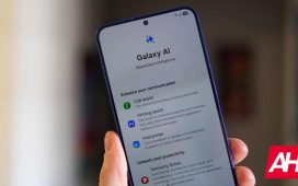
Google recently showed off Gemini for Android Auto, giving us a glimpse of the platform’s much-anticipated upgrade. Beyond this, we know Google is also working on major Android Auto features like a climate control UI and even a light theme. Alongside these, Google is also experimenting with smaller changes, such as moving around the media playback buttons, which has left us scratching our heads a little.
An APK teardown helps predict features that may arrive on a service in the future based on work-in-progress code. However, it is possible that such predicted features may not make it to a public release.
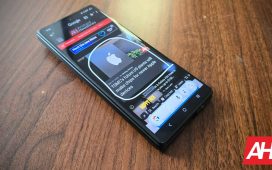
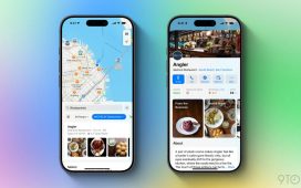
Android Auto v14.4.152004 is testing out a tweaked media player UI. Conventionally, the media player UI has the buttons placed in the order of Rewind/Previous, Play/Pause, and Forward/Next, almost following a “past, present, and future” timeline. This layout is followed by most media player apps on your phone, and they are mirrored in the same way onto your car’s head unit with Android Auto, too. You can see this conventional media player button layout in the Android Auto screenshots below:
However, Android Auto is experimenting with the layout by swapping positions for the Play/Pause button with the Rewind/Previous button. The Play/Pause button also has a larger background fill. You can see the revised layout in the screenshots below:
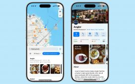
However, this isn’t a Spotify tweak as it extends across media player apps. You can see the revised layout in the YouTube Music and JioSaavn apps on Android Auto in the screenshots below:
What’s the point of the change, you ask? Your guess would be as good as ours.
The swapped position could theoretically make hitting the Play/Pause button easier when driving, which is our best guess. The larger background fill for the button also makes it a bigger target to touch. When reaching for the Play/Pause button, you can accidentally hit only one other button (the Previous button on the right) in the revised layout. In contrast, the current design has room for error in either direction.
However, these arguments weigh against muscle memory, and it’s much more important to respect it while driving.
It’s worth noting that the changed layout only affects the card UI on the Android Auto home screen. You can tap the card to open the full app with the regular media playback controls.
Which media player button layout do you prefer in Android Auto?
2 votes
The revised media player button layout isn’t currently rolling out to users. We’ll keep you updated when we learn more.


