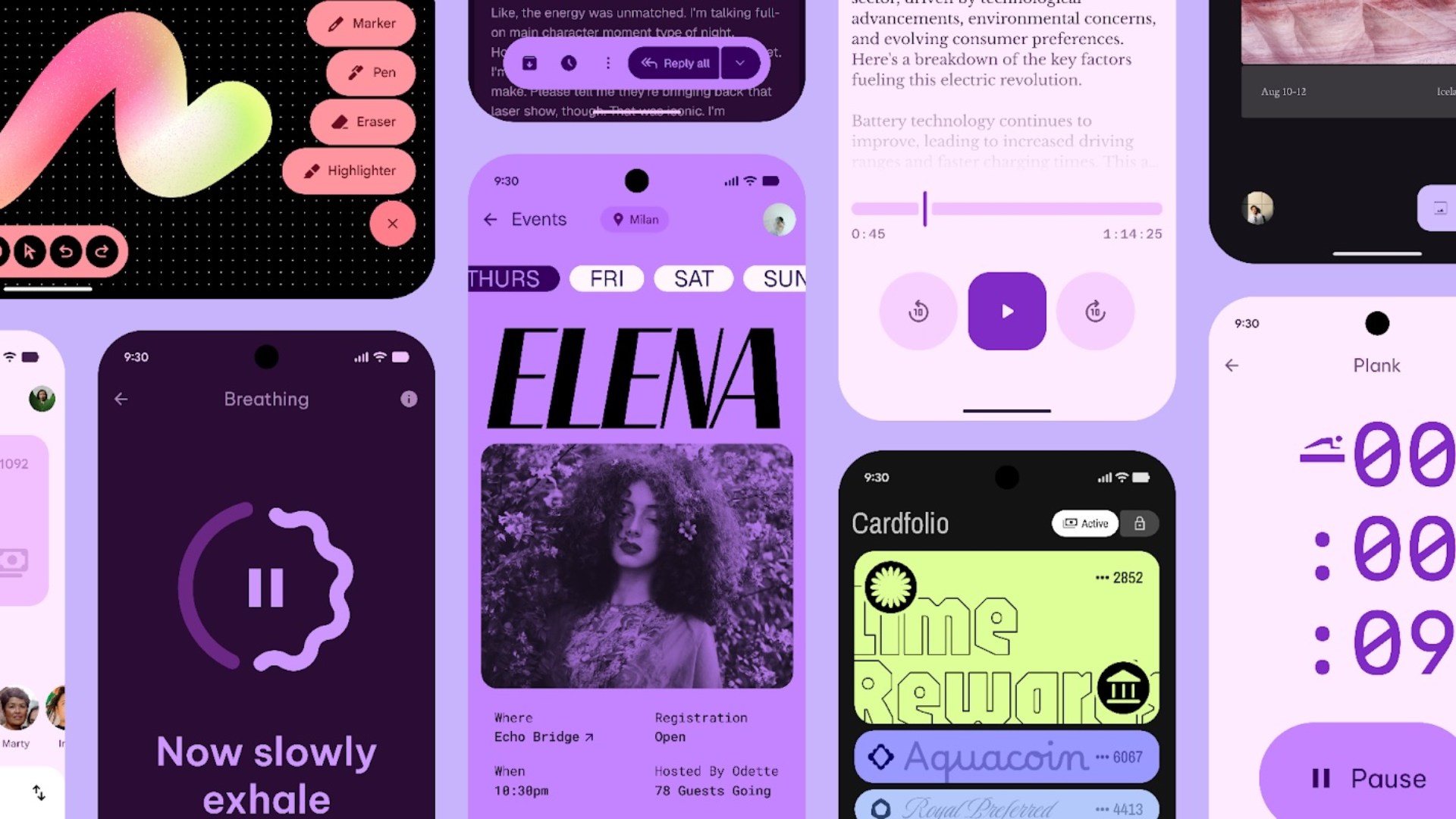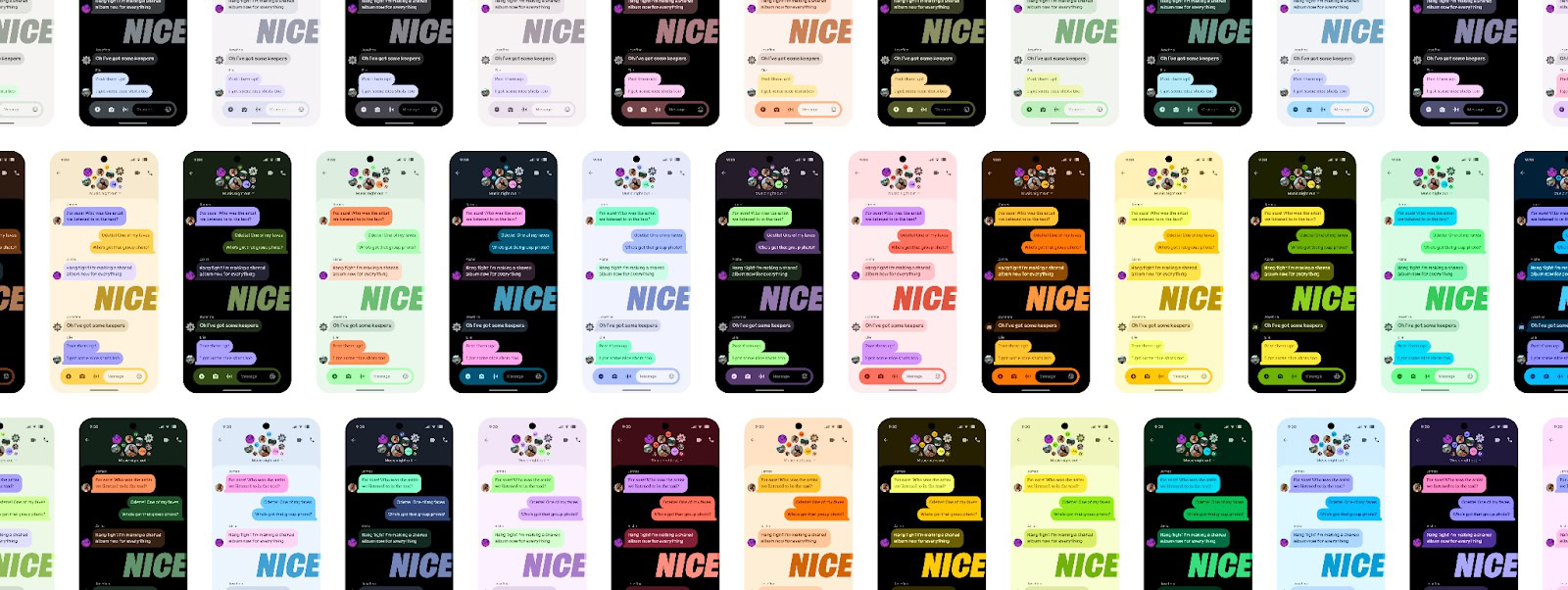
At The Android Show today, Google officially introduced Material 3 Expressive, the next evolution of Android’s design language, set to arrive with Android 16. This sweeping UI update is a significant step in Google’s ongoing effort to make Android and Wear OS more visually engaging, emotionally resonant, and interactive. With new motion physics, component updates, fresh color schemes, impactful fonts, and more, Material 3 Expressive is poised to reshape how Android feels and functions. Here’s a closer look at what this new design direction means for Android users, what devices will support it, and when you can expect to see it.
Material 3 Expressive: What is it, and why is Google bringing it?

Android 16’s big story is its look. Material 3 Expressive builds on Material Design, Google’s open-source design framework, and is a direct evolution of Material You (Material 3), introduced four years ago with Android 12. To be clear, this is not a new generation like “Material 4.” It’s an extension of the Material You design philosophy, not a replacement.
So why this update? According to Google, Material 3 Expressive is its most rigorously researched design refresh ever. It stems from 46 global studies, hundreds of design variations, and insights from over 18,000 participants. What emerged from that effort is that “expressive interfaces” have the power to stir emotions, convey personality, and enhance usability.
What do you think of Google’s Material 3 Expressive design for Android?
1800 votes
Google says that in its testing, expressive designs consistently outperformed others on attributes like playfulness, creativity, energy, and friendliness. Usability also saw improvements, with users identifying key UI elements up to four times faster in expressive layouts, making it not just a visual but a functional update.
Material 3 Expressive brings a host of UI upgrades designed to make Android feel livelier and more intuitive. Some of the key themes include:
- Springier, natural-feeling animations that enhance touch interactions
- New icon shapes and refreshed typography
- Background blur effects for depth and focus
- Updated color themes
- Home screen and Quick Settings enhancements for a more dynamic layout
- Visual redesigns for many Google apps, bringing them in line with the new expressive aesthetic
Before we break down everything Material 3 Expressive has to offer, let’s talk a bit about its availability.
When will Material 3 Expressive roll out?
Material 3 Expressive will debut on Pixel devices running Android 16. And yes, that includes more than just phones and tablets; the Pixel Watch is also getting a taste of the new design language.
However, don’t expect to see it immediately when Android 16 rolls out publicly. We previously spotted traces of these UI changes hidden in Android 16 Beta 4, the final beta before launch, but they weren’t enabled by default on that update. Now we know why.
Material 3 Expressive will begin rolling out to Pixel phones later this year.
In a press briefing, Google confirmed that Material 3 Expressive will begin rolling out to Pixel phones later this year, following the stable Android 16 release in June.
“So, the updates for Material Expressive are going to be available on Pixel devices first later this year, but it’s not going to be part of the public release in June,” confirmed Allen Huang, Google’s Director of Product Management for Pixel and Android system UI.
However, the company did say that Material 3 Expressive will be available “at the end of the month,” hinting at a possible beta build that’ll carry some of the new design elements. It’s likely Google was hinting at the first Android 16 QPR1 beta release, but we’ll have to wait and watch.
These changes will also appear across Google apps later this year. Other Android OEMs are also expected to adopt elements of Material 3 Expressive, likely blended with their own custom Android skins.
What’s new in Material 3 Expressive?
Let’s explore the new Material 3 Expressive design changes you can expect to see on your Android phones and apps.
New animations and motion physics
Material 3 Expressive brings a new spring-based motion system that promises to make interactions more fluid, dynamic, and natural. For instance, when you dismiss a notification, there’s a smooth detach effect with a haptic rumble, and the surrounding notifications also subtly react to your swipe. You’ll see similar effects when closing an app in the Recents screen, interacting with the volume sliders, or pulling down the notification shade. Developers can tap into these expressive spring physics using updated Material motion APIs to ensure their app transitions also feel consistent with Material 3 Expressive.
More dynamic and personalized color themes

Material 3 Expressive also refines Android’s dynamic color theming engine with richer, more nuanced color palettes that aim to improve visual hierarchy and personalization. Google says the updated system ensures clearer separation between primary, secondary, and tertiary tones, helping users better understand which actions matter the most. By building visual contrast, the new themes aim to prevent interface elements from blending together. That said, Material 3 Expressive themes will continue to reflect custom wallpapers and preferences.
Typography refresh
Typography is also getting a serious upgrade with Material 3 Expressive, bringing new type styles designed to enhance user attention. Headlines and key actions are now easier to spot thanks to larger sizes, heavier weights, and improved hierarchy. Whether you’re starting a recording or checking unread messages, the new Material 3 Expressive type styles will make those interactions feel more immediate. Google is making these updates available to developers through the Material type scale, so Android apps will soon offer richer layouts with improved clarity. The company says Material 3 Expressive’s typography and aforementioned color theming changes will also apply across Google apps (see video above). You can see an example of this in our leaked preview of the Google Clock’s Material 3 Expressive redesign.
New shapes, transitions, and updated components
Material 3 Expressive brings a new shape library to Android with 35 distinctive options that will let app developers create more diverse interfaces. Android users will see smooth shape-morphing transitions, such as a square morphing into a squircle, to provide a more fluid and interactive experience. You can see an example of this in the video embedded above.
Material 3 Expressive also carries an upgraded suite of components, including fifteen new or refreshed UI elements. There will be new additions like button groups, split buttons, toolbars, loading indicators, and a floating action button (FAB). Existing elements like app bars, carousels, icon buttons, and navigation bars have also been refined with improved customization for shapes, sizes, and styles. We also previously showed you examples of new status bar icons for Wi-Fi, mobile data, airplane mode, and battery level.
Enhanced system UI: Quick Settings, notification shade backgrounds, and more
The Android system UI is becoming more customizable with Material 3 Expressive, and the biggest example can be seen in Quick Settings. Users will now be able to pin more controls, like Flashlight or Do Not Disturb, for faster access. Quick Settings tiles are also becoming resizable, allowing users to pack more features into that space than ever before.
Meanwhile, the notification shade backgrounds now feature a subtle blur effect that adds depth, allowing you to stay in context while navigating your phone.
A new feature called Live Updates, which you’ve probably already seen in previews, makes it easier to track real-time progress from apps like Uber Eats or Google Maps. It puts delivery times or rideshare statuses front and center without needing to open an app. All of these can be expected to make for a more intuitive system experience.
Material 3 Expressive on Pixel Watch and Wear OS
Material 3 Expressive is also making its way to Wear OS, beginning with the Pixel Watch. While Google has confirmed that colors still won’t sync between phones and wearables, Material 3 Expressive’s dynamic color theming is also coming to Wear OS, with its effects reflected consistently across the system UI.
Animations are now designed to follow the natural curve of the Pixel Watch’s circular display, creating a more immersive and fluid experience. Users can expect the same springy transitions and motion effects found on Android phones, helping unify the overall experience of the ecosystem.
The update also introduces shape-morphing elements that adapt elegantly to the watch’s compact form. Daily interactions, like entering a PIN or controlling media, are becoming smoother and more responsive. Glanceable buttons now stretch edge-to-edge for easier tapping, and refreshed Tiles offer quicker access to essential features like workouts or favorite contacts. Google also promises real performance improvements, including up to 10% better battery life with the Wear OS 6 update.


