- Microsoft has revealed fresh changes for normal Windows 11 devices, alongside all the revelations just made about Copilot+ PCs
- This includes a big move with redesigning the Start menu which was previously leaked in testing
- Hopefully the choice to drop the recommendations section from the Start menu, as seen in that leak, will be kept in
Microsoft has confirmed that a major redesign of the Windows 11 Start menu is coming, along with some other useful-sounding tweaks.
In case you missed it, there’s just been a major reveal about all the goodies inbound for Copilot+ PCs – including an AI agent embedded in the Settings app, to sort out changes for you – but there were also revelations regarding normal Windows 11 PCs (you know, the kind that almost everyone still uses).
The revamped Start menu is not a surprise, as a leaker previously uncovered the work hidden in test builds. However, with Microsoft now officially revealing it, we know it’ll be live and being tested in Windows 11 preview builds soon.
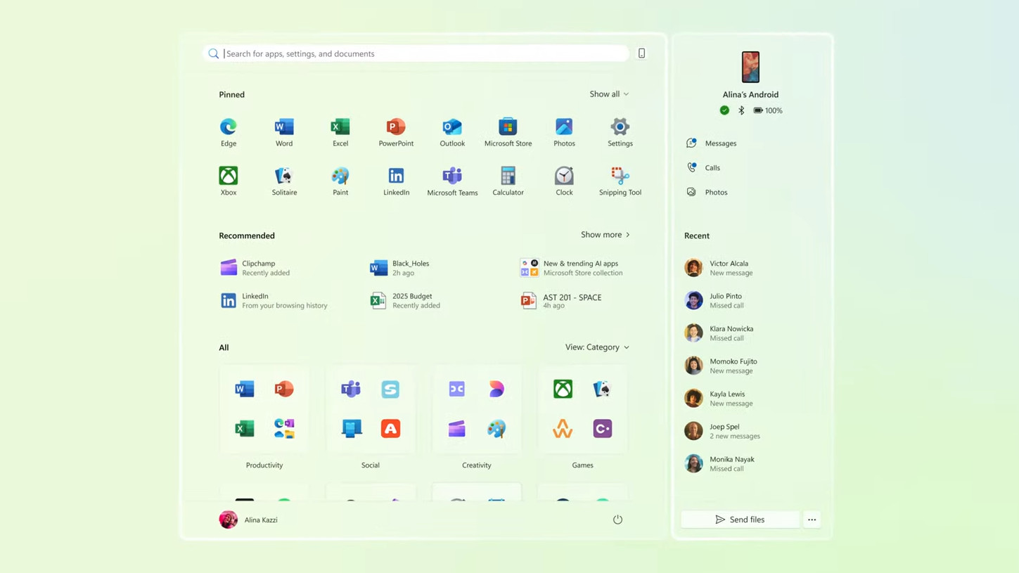
The idea is to take the Start menu and turn it into a single scrollable panel, with pinned apps at the top, recommendations underneath, and the full exhaustive list of apps installed on your PC under that at the bottom. The current layout has that full list of apps split off into a separate panel (which you switch to with a button click).
Consolidating all this into one section makes sense to me, and the menu will wider to help accommodate the extra content.
On top of this, Microsoft has been doing some tinkering with the layout choices for the full list of apps to enable them to fit the available space better. That’s already underway in testing, allowing you to organize the app list in a more compact manner using categories as one option.
Microsoft notes that: “The new all apps category view automatically sorts based on the apps and categories you use most, so you can quickly access all your favorites.”
Aside from the work on the Start menu, Microsoft is also introducing AI actions in File Explorer. This means that when you’re working with File Explorer – the folders on your desktop – you’ll get AI-related actions on the right-click menu. So, for example, an image file might have an AI ability pertaining to the Photos app as a shortcut.
This is essentially a vanilla take on ‘Click to Do’, which is the more in-depth context-sensitive system of AI functionality incorporated with Copilot+ PCs (which have a fair few extra AI capabilities, of course, and that number is slowly increasing as we’ve seen).
Windows 11’s Notepad app is also getting beefed up, with AI features that allow for generating text or summarizing an article. Some more formatting options are arriving, too, in the form of headings and support for lists, plus bolding and italics.
These appear to have been drafted across thanks to the demise of WordPad, with Notepad slowly getting more features added to offer a workable alternative in Windows 11. (Although some folks don’t want Notepad to be bloated with this stuff, it must be remembered).
All the above is inbound for Windows 11 testers soon, and Microsoft says these features should arrive at some point this month. It may still be a good while before they filter through to release versions of the OS, mind you – especially that Start menu overhaul, which is obviously a sizeable undertaking. That could be destined for Windows 11 25H2, which Microsoft is rumored to be working on now.
Analysis: a good Start – but I hope Microsoft retains a key option leaked in testing
It’s good to see that this new layout for the Start menu is coming into play, because, as I remarked when it was first sighted hidden in test builds, I think it’s a laudable transformation for this crucial part of the Windows 11 interface (ignoring that awful green color scheme visited upon the desktop in Microsoft’s teaser, I should add).
Some of my praise, mind you, was based on the fact that the leak also highlighted a new option to get rid of the recommendations panel entirely in the Start menu. Now, Microsoft certainly doesn’t mention that here, but the company wouldn’t go into any nitty-gritty details in a brief first reveal like this.
So I’m hoping that this option will still be available when this new layout officially comes to Windows 11 test builds – and it makes sense that it would be, because, as noted, space is at a premium here, and dumping that section of the panel would be handy in that respect. The choice to ditch recommendations is also an ability that many Windows 11 users have been keen to see implemented (and that’s an understatement).
For those worried about the overall size of the Start menu with the offshoot Phone Link side panel also being present – on the right-hand side, as you can see in Microsoft’s above screenshot of the new UI – it doesn’t hog the whole desktop anymore, as it seemed to do when a leaker fudged it to appear in a Windows 11 test build recently.
All in all, the redesigned Start menu is shaping up well. Let’s just keep our fingers crossed that the choice of jettisoning the recommendations section isn’t something that Microsoft has had a rethink about.


