When I woke up yesterday morning, I didn’t expect the One UI 8 beta to be waiting for me on my Galaxy S25. Yet, that’s precisely what happened. So, with my coffee in one hand and my S25 in the other, I spent my Wednesday morning downloading Samsung’s latest beta software.
One UI 8 isn’t nearly as drastic an update as One UI 7 is, but that’s not to say there aren’t any significant new features. In the 24 hours I’ve been using the beta, I’ve found a handful of pretty fantastic changes.
Here are a few things I love about the One UI 8 beta, plus one thing I hate.
Do you think One UI 8 is a good update so far?
2 votes
The wonderful 90:10 multitasking UI
Joe Maring / Android Authority
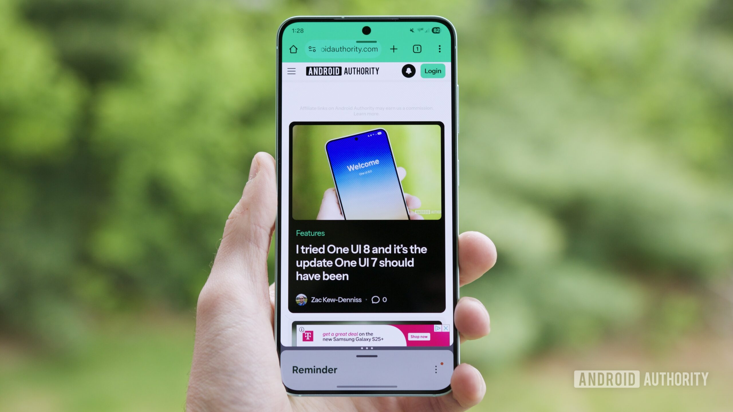
Without a doubt, my number one favorite new feature in the One UI 8 beta is the new 90:10 split screen option for multitasking. This is technically an Android 16 feature rather than something specific to One UI 8, but since it isn’t present in the Android 16 QPR1 beta, it’s the first time we’ve had hands-on experience with it.
One UI 7 already offers a lot of freedom for how you want to split two apps you’re running simultaneously, though the furthest you can go is a 70:30 split. It’s not horrible, but it can still make some apps feel squished and difficult to navigate.
With the new 90:10 option in One UI 8, you can now run one of your apps in a mostly full-screen view, while your other app is hidden as a small sliver at the top or bottom of the screen — and you can quickly change that app to the full-screen view just by tapping on it.
This is virtually identical to how Open Canvas works on OnePlus phones, and I couldn’t be happier with it. Now, I can use one app without compromising its UI while still having another application just a tap away. It’s far and away my favorite way to use split-screen multitasking on Android, and I’m thrilled to now have it on Samsung phones with One UI 8.
The new Samsung Reminder app is excellent
Joe Maring / Android Authority
For the past few months, Google Tasks has been my go-to reminder and to-do list app. I don’t see that changing any time soon, but the new Samsung Reminder app in One UI 8 is tempting me.
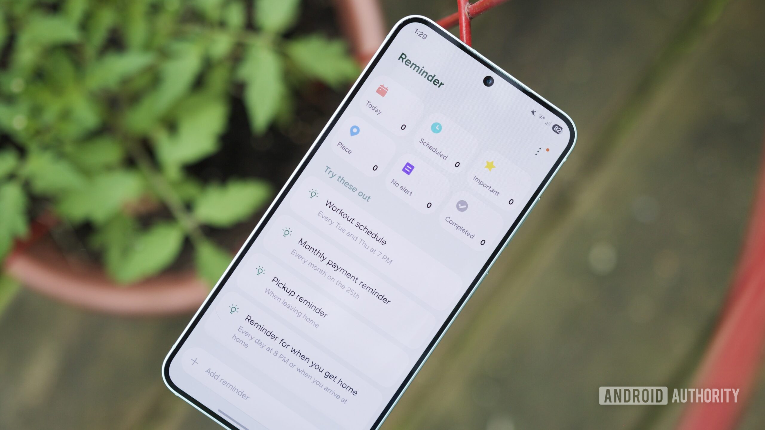
Samsung has completely overhauled the app’s homepage, with the most significant change being the addition of new categories at the top. Previously, One UI 7 showed your custom reminder categories at the top, while categories like Today, Scheduled, Important, and Place were tucked away in a side menu. Now, all of those are front and center at the top of the Reminder app, allowing you to immediately see how many reminders are in each of those categories.
The UI for adding a new reminder is better, too. There are more reminder options, adding a time to a reminder is much simpler, and the location UI is also improved. Additionally, if you use the Samsung Calendar app, you can now create a new reminder from there. It’s a lot of smaller tweaks, but I think they all come together to make Samsung Reminder a far more enjoyable experience than it used to be.
As someone who doesn’t live that deep in the Samsung ecosystem, the broader availability of Google Tasks will likely keep me there for the time being. Still, this is a substantial update on Samsung’s part, and I hope it motivates Google to give Tasks similar attention.
A much-needed Quick Share update
Joe Maring / Android Authority
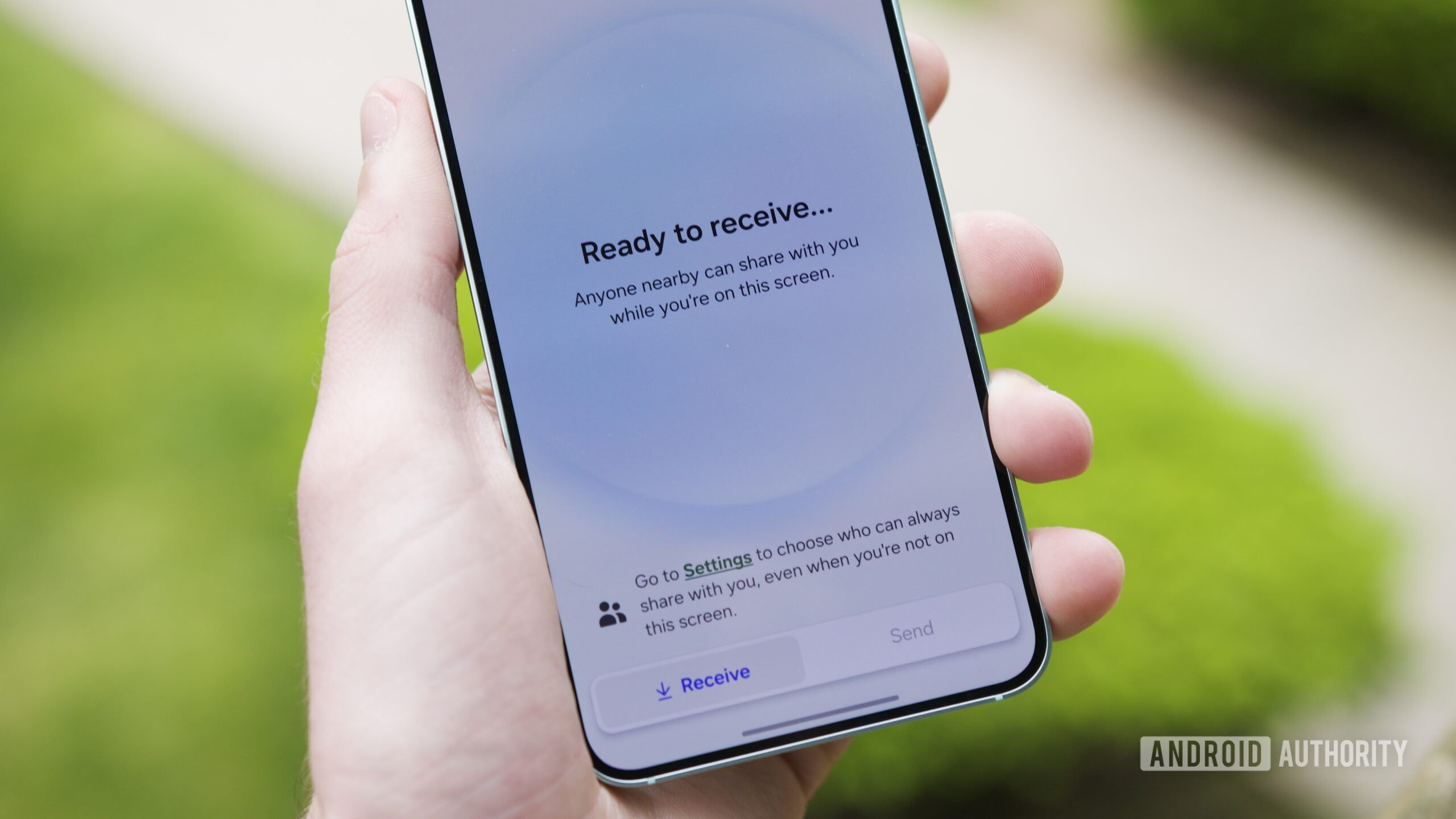
This is a relatively minor change compared to the multitasking and Reminder updates, but it’s still one that I appreciate. If you’re running the One UI 8 beta and share something via Quick Share, you’ll notice that there’s now a completely new interface.
In One UI 7, tapping the Quick Share toggle from the quick settings merely displayed a pop-up menu for you to change who can share files with you. However, in One UI 8, tapping the same Quick Share toggle now takes you to a brand new interface that’s split into dedicated Receive and Send pages. Additionally, from the Send page, you can select files you want to share right there, rather than having to do so through Android’s regular sharing menu.
The tech behind Quick Share is great, but its user-facing presence on Android has always felt severely lacking. This is a massive step in the right direction, and I honestly think it’ll get me to use Quick Share more often.
This is something we expect all Android phones to eventually get, but if you want to try it now, you’ll only find it in the One UI 8 beta.
What I hate about the One UI 8 beta
Joe Maring / Android Authority
In my limited time with the One UI 8 beta, I haven’t found anything outright broken or a change that’s been made for the worse. If anything, it feels a lot like One UI 7, just with some extra features and a bit of extra polish.
If that’s the case, what is it about One UI 8 that I hate? It’s what’s not here.
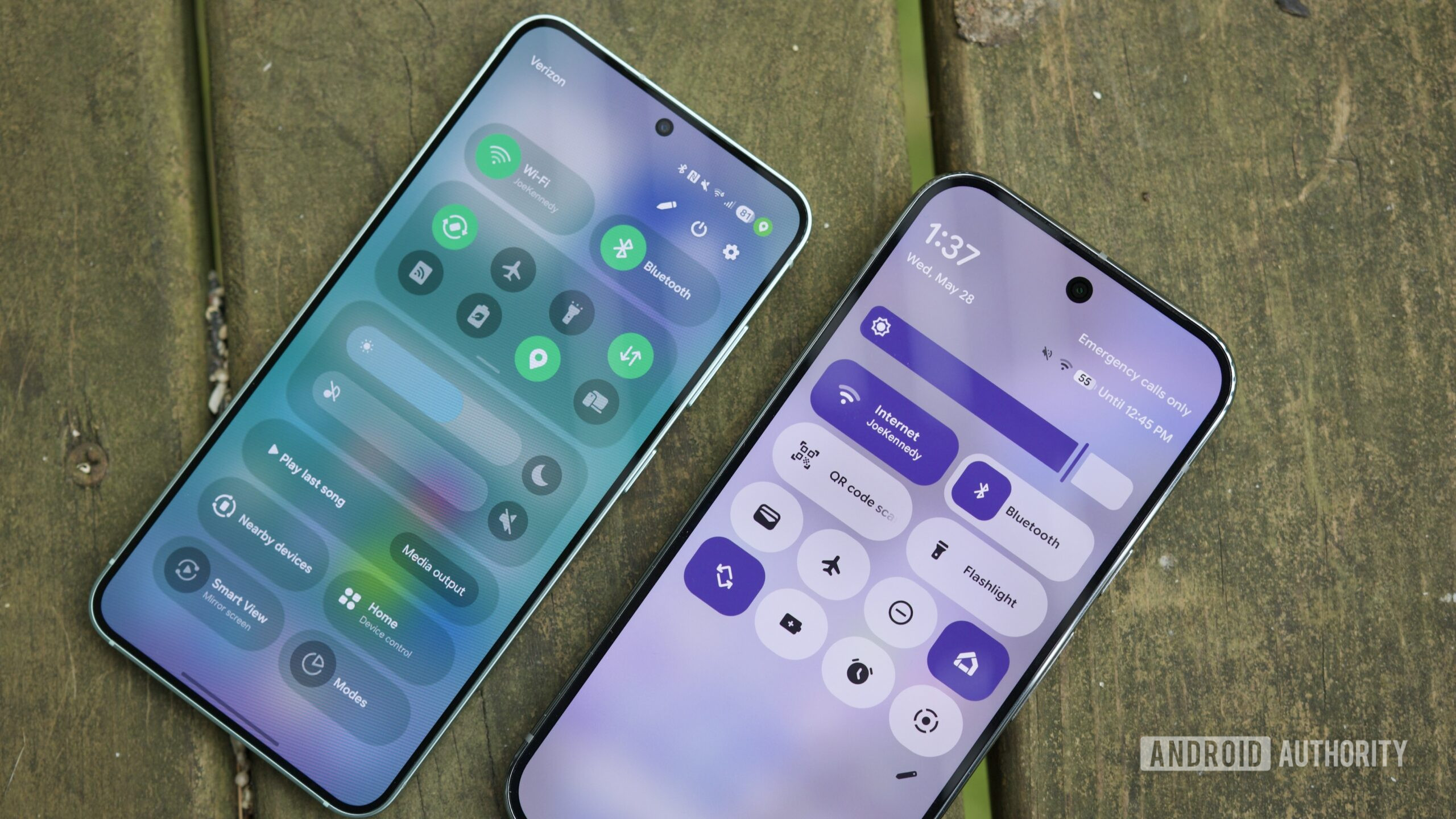
One of the biggest changes in Android 16 is Google’s new Material 3 Expressive design. Having played with it in the Android 16 QPR1 Beta, I’m thrilled with how it’s coming along. It makes Android feel alive and responsive in a way Google has been working toward since Android 12, but that vision feels like it’s finally 100% realized in Android 16.
Now that I’ve experienced Google’s new design language, I sorely miss not having it in One UI 8.
Whether it’s the lovely animations with notification cards or the recent apps page, the gorgeous blurred UI elements, or the enhanced haptic feedback throughout the interface, none of those elements from Android 16 QPR1 are present in One UI 8. And if you ask me, One UI 8 isn’t nearly as enjoyable because of it.
To be clear, none of this is surprising. Samsung has its own distinct software identity with One UI, and we knew the company wouldn’t ditch it in favor of what Google has cooked up with Material 3 Expressive. Still, now that I’ve experienced how good Google’s new design language is, I sorely miss not having it in One UI 8.
A nice evolution for One UI
Joe Maring / Android Authority
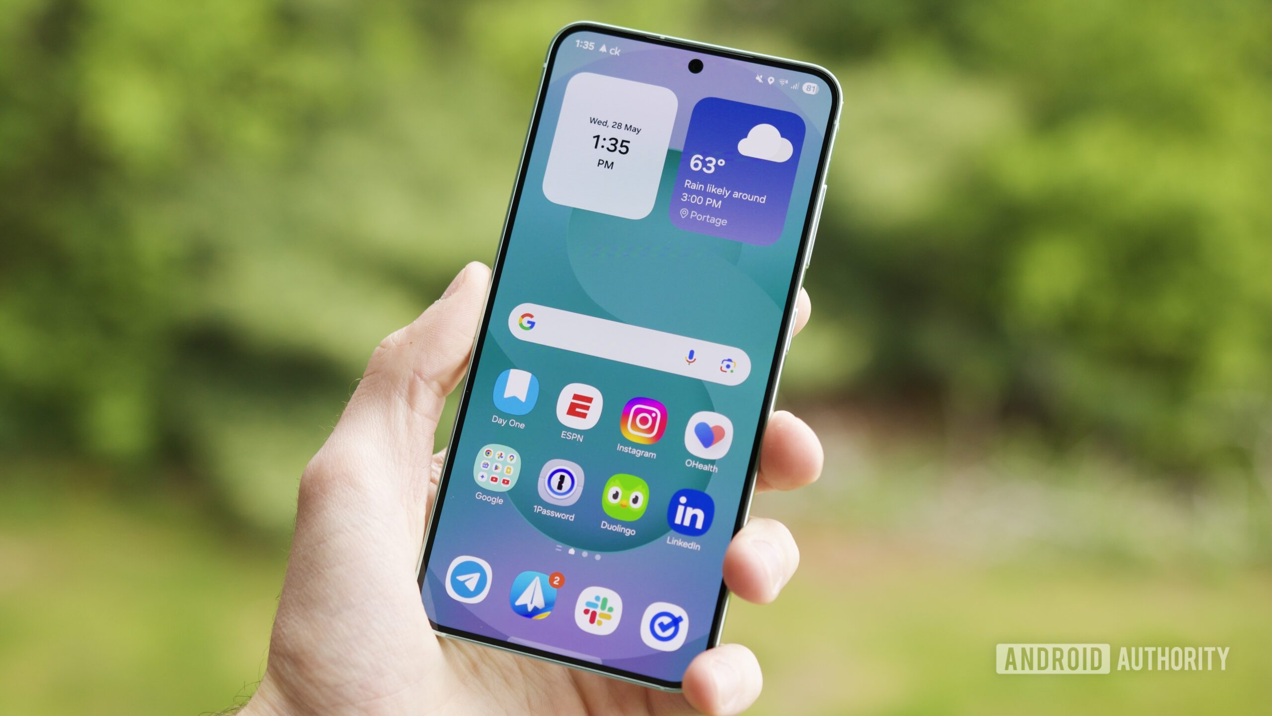
Hot on the heels of an update as revolutionary as One UI 7, I can see some people looking at One UI 8 and finding it a bit boring. But that was always going to be the case. Samsung was never going to give us two back-to-back updates on that scale. Instead, One UI 8 is an evolution of what Samsung started with One UI 7, and if you ask me, it’s (almost) everything this update should be.
Would it be even better with Material 3 Expressive? Absolutely. But even without that, I’m happy to see where Samsung is headed with One UI 8.

