Google put on an Android Show today to offer a glimpse at its upcoming interface changes with Android 16, in addition to a slew of Gemini news. It didn’t show off any new devices running the new look; instead, Google offered advice to developers and an explanation of its overall design philosophy. That philosophy seems very… purple.
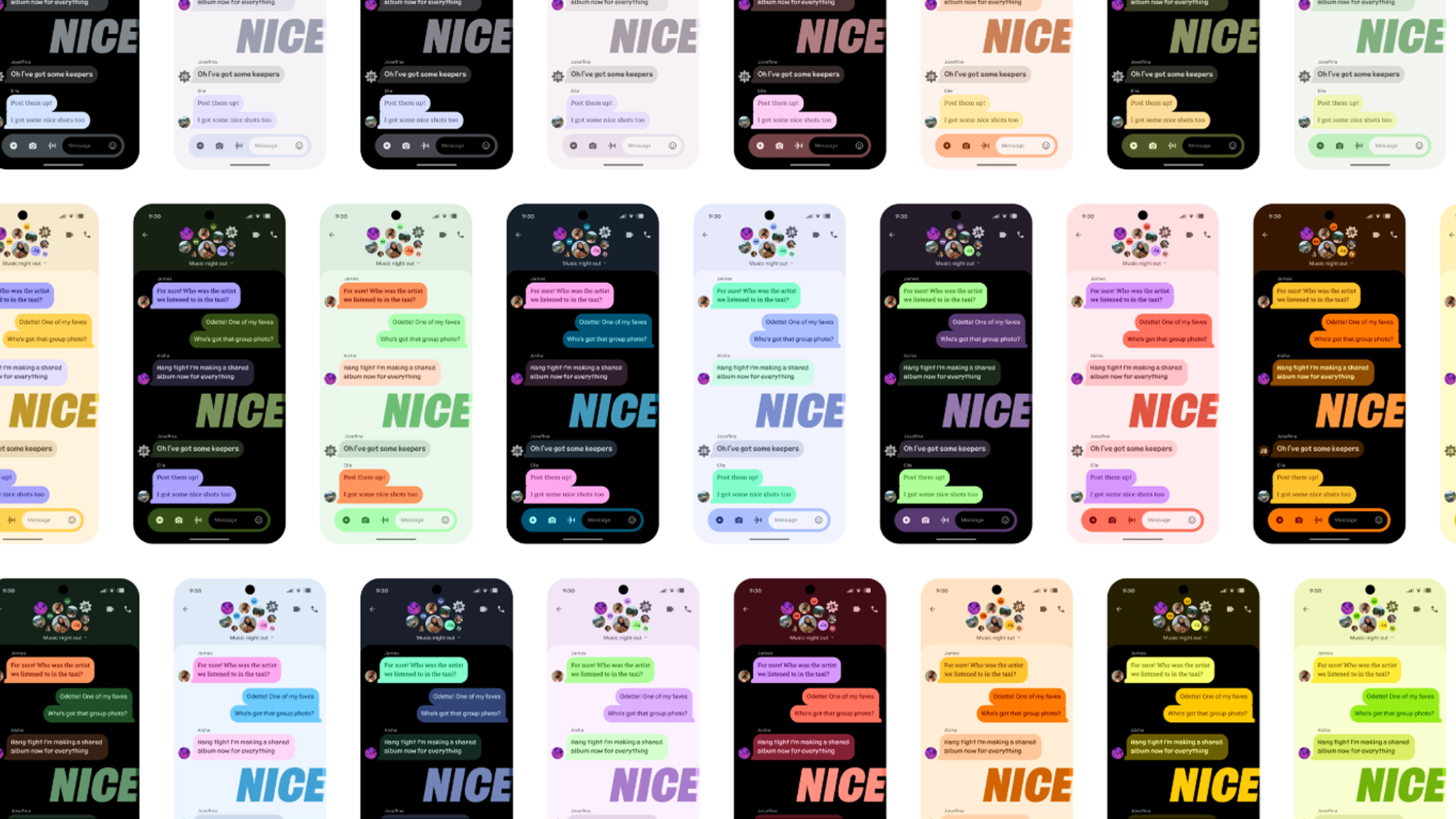
The new Material 3 Expressive guidelines call for extensive use of color (especially shades of purple and pink), new shapes in a variety of sizes, new motion effects when you take action, and new visual cues that group and contain elements on screen.
Google says it has done more research on this design overhaul than any other design work it’s done since it brought its Material Design philosophy to Android in 2014. It claims to have conducted 46 studies with more than 18,000 participants, but frankly, I’m not a UX designer, so I don’t know if that’s a lot.
Google’s Material 3 Expressive is the new look of Android 16
After all of that work, Google has landed on this: Material 3 Expressive. The most notable features, once you get past the bright and – ahem – youthful colors, are the new motion effects.
For instance, when you swipe to dismiss a notification, the object you are swiping will be clear while other objects will blur slightly, making it easier to see. The other notifications nearby will move slightly as you swipe their neighbor. Basically, there will be a lot more organic-looking motion in the interface, especially on swipes and the control levers.
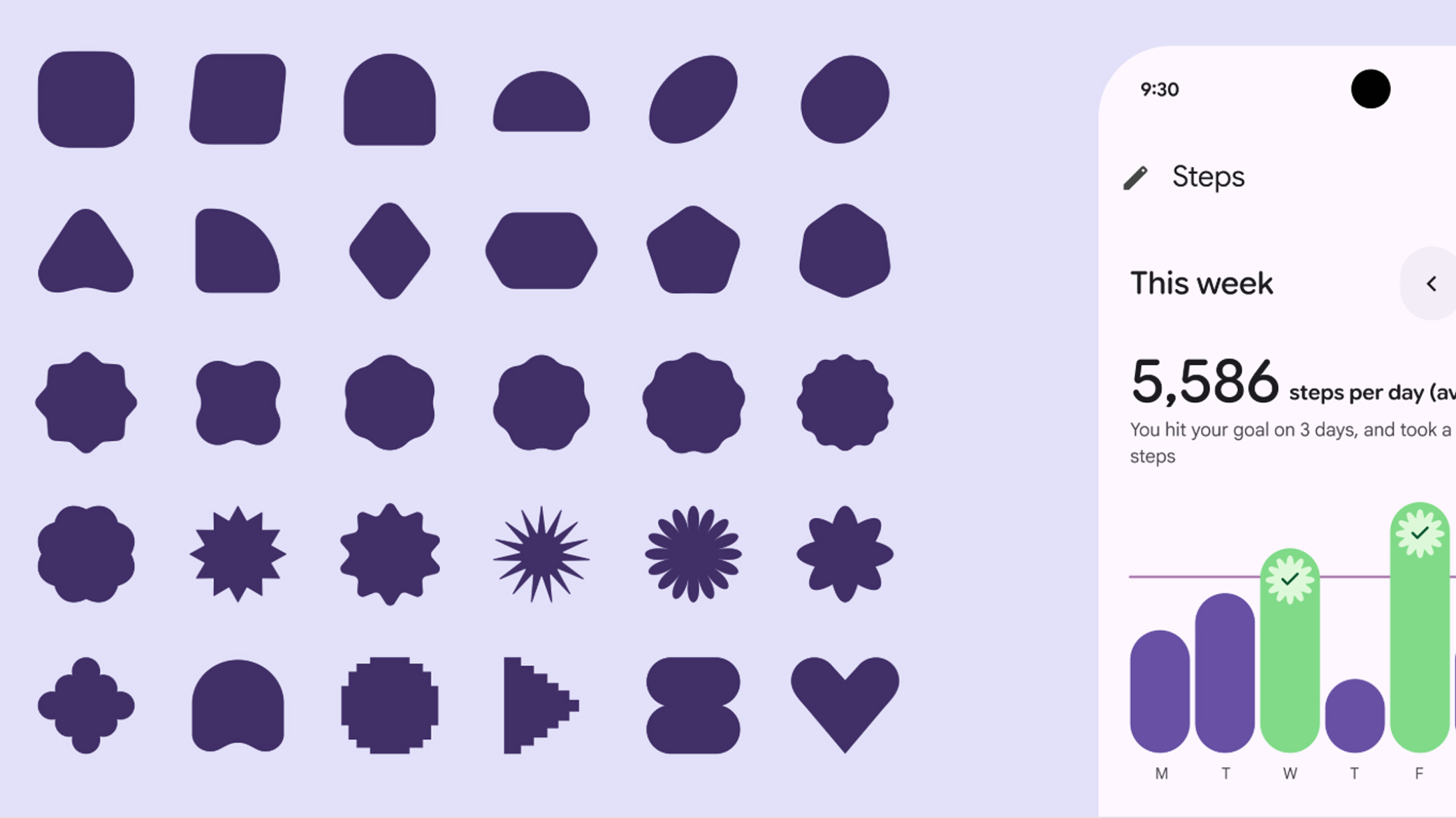
There will be new type styles as well built into Android 16, with the ability to create variable or static fonts. Google is adding 35 more shapes to its interface library for developers to build with, along with an expanded range of default colors.
Google didn’t say that its new Material 3 Expressive design language was targeting iPhone fans, but the hints are there. The next version of Android won’t look cleaner and more organized, instead, Google wants to connect with users on an ‘emotional’ level. According to Google’s own research, the group that loves this new look the most are 18-24 year olds, ie, the iPhone’s most stalwart fan base.

In its official blog post, Google says, “It’s time to move beyond ‘clean’ and ‘boring’ designs to create interfaces that connect with people on an emotional level.” That connection seems to be much stronger among young people. Google says that every age group preferred the new Material 3 Expressive look, but 18-24 year olds were 87% in favor of the new look.
Apple’s iPhone fanbase is strongest in this age group, if not the generation that’s even younger. It makes sense that Google is making big changes to Android. In fact, this refresh may be overdue. We haven’t seen many inspiring new features in smartphones since they started to fold, and foldable phones haven’t exactly caught on. I’m surprised Google waited this long to improve the software, since there wasn’t any huge hardware innovation in the pipeline (temperature sensors, anybody?).
Material 3 Expressive is coming to more than just Android phones
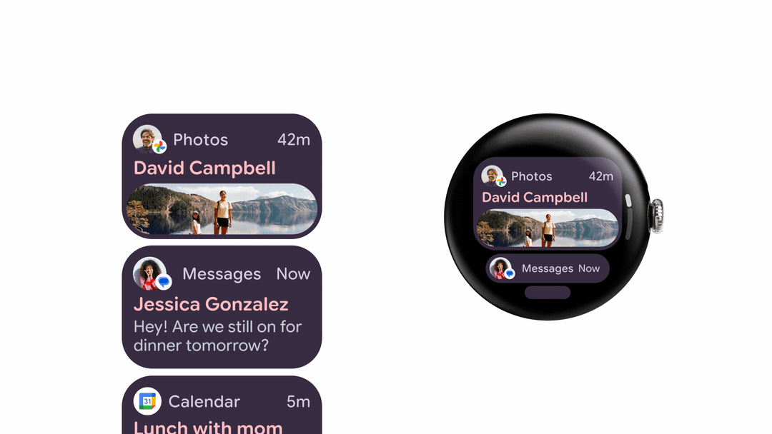
The new Material 3 Expressive look won’t be limited to Android 16. Google says Wear OS 6 will get a similar design refresh, with more colors, motion, and adaptable buttons that change shape depending on your watch display.
Wear OS watches will also be able to use dynamic color themes, just like Android phones. Start with an image or photo and Wear OS will create a matching color theme for your watch to complement what it sees.
Even Google’s apps will start to look more Expressive. Google says apps like Google Photos and Maps will get an update in the months ahead that will make them look more like Android 16.
Google borrows a few iPhone features for Android 16, including a Lockdown Mode
Google also demonstrated Live Updates, a new feature that borrows from the iPhone to show you the progress of events like an Uber Eats delivery. The iPhone does this in the Dynamic Island, and Google is adding this feature to the top of the Android 16 display.
Security was a big focus of the Android Show, starting with new protections against calling and text message scams. Google is securing its phones against some common scammer tactics. For instance, scammers might call pretending to be from your bank and might ask you to sideload an app.
With Android 16, you won’t be able to disable Google’s Play Protect app-scanner or sideload any apps while you are on a phone call. You also won’t be able to grant permission to the Accessibility features, a common workaround to get backdoor access to a phone.
Google’s Messages app will also get smarter about text message scams. It will filter out scam messages that ask you to pay overdue toll road fees or try to sell you crypto.
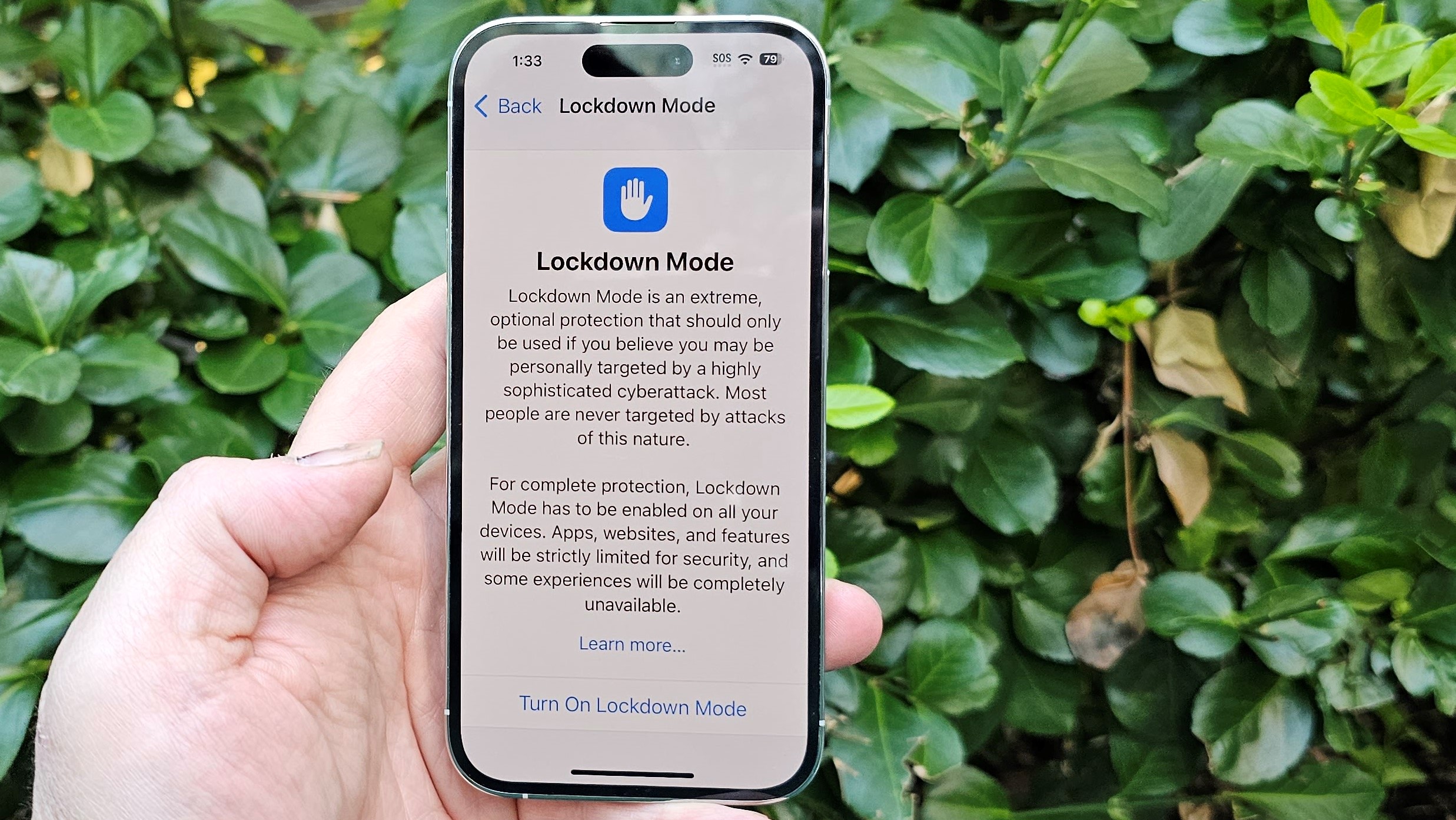
Google is also enabling Advanced Protection, its own version of Apple’s Lockdown Mode, on Android 16. Advanced Protection is a super high-security mode that offers the highest level of protection against attacks, whether over wireless networks or physically through the USB port.
Basically, if you’re a journalist, an elected official, or some other public figure and you think a government is trying to hack your phone, Google’s Advanced Protection should completely lock your phone against outside threats.
If you don’t need that much security but you still want more peace of mind, Google is improving its old Find My Device feature. Android 16 will introduce the Find Hub, which will be a much more robust location to track all of your devices, including Android phones, wearables, and accessories that use ultra-wideband (UWB), similar to Apple AirTags.
Google is introducing new UWB capabilities to help find objects nearby, and those will roll out to Motorola’s Moto Tag first in the months ahead. The new Find Hub will also be able to use satellite connectivity to help locate devices and keep users informed. Plus, if you lose your luggage, Google is working directly with certain airlines like British Airways to let you share your tag information so they can go look for the bag they lost.
Gemini is coming to your car… and your TV… and your watch, and…
Today’s Android Show wasn’t all about Android. Google also made some big announcements about Google Gemini. Gemini is coming to a lot more devices. Gemini is coming to Wear OS watches. Gemini is coming to Android Auto and cars that run Google natively.
Gemini is coming to Google TV. Gemini is even coming to Google’s Android XR, a platform for XR glasses that don’t even exist yet (or at least you can’t buy them). For a brief moment in the Android Show, we caught a glimpse of Google’s possible upcoming glasses.
You’ll be able to talk to Gemini Live and have a conversation in your car on the way to work. ‘Hey Gemini, I need advice on asking my boss for a promotion!’ or ‘Hey Gemini, why is my life so empty that I’m talking to a machine in my car when I could be listening to music or a true crime podcast?’
I may sound like an AI skeptic, but Google’s own suggestions are equally dystopian. Google says on the way to your Book Club, you might ask Gemini to summarize that book you read ages ago (and mostly forgot) and suggest discussion topics. That does not sound like a book club I want to join.
Google did not offer any specific timing for any of the features mentioned in the Android Show, and only said these concepts would appear in the months ahead. It’s unusual for Google to share so much news ahead of Google I/O, which takes place May 20-21 near its HQ in Mountain View, CA. I’ll be on the scene at Google I/O with our News Chief Jake Krol to gather up anything new.
With the Pixel 9a launch already passed, and now team Android spilling all the beans, I suspect Google I/O is going to be mostly about AI. Google is getting these tidbits out of the way so that I don’t waste time asking about new phones when it wants to talk more about Gemini and all the new AI developments. Or perhaps, even better, the Android XR news today was just a hint of what’s to come. Stay tuned, we’ll know more next week!


