Technology
Fans found the new icon to be unattractive compared to the simplistic older design
(Web Desk) – It is one of the most instantly recognisable symbols of any tech company. But now, Google has updated its iconic logo for the first time in a decade.
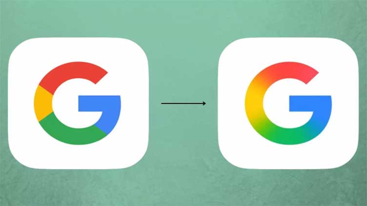
In the new icon, the blocky red, yellow, green, and blue of the original ‘G’ has been replaced with a gentle gradient.
This subtle update brings the search engine’s design more in line with the gradient used by Google’s Gemini AI.
The new icon is now in use for the Google Search app on iOS and Google’s Pixel phones with the Android operating system.
However, Google is yet to roll out the gradient further, and the new design isn’t currently visible on other Android phones or on web browsers.
While some fans said they preferred the new look, many others roasted Google with memes mocking the subtlety of the change.
So, can you spot the difference?
On X, formerly Twitter, social media users joked that the new icon was so similar to the earlier design that it was almost impossible to spot the difference.
Commenters joked that it looked like they had simply ‘taken my glasses off’ and said the designs were identical.
Meanwhile, others took aim at the design process behind the updated look.
One commenter wrote: ‘Imagine how many PMs, designers, meetings, committees, and time was spent on adding a gradient to Google’s new logo.’
Another chimed in: ‘Google app rebrand – Whatever you paid those designers, I would’ve done it for way less.’
While one commenter jokingly asked: ‘How many millions did they spend on this?’
Likewise, some commenters simply found the new icon to be unattractive compared to the simplistic older design.
A commenter wrote: ‘New Google app logo for iOS. What have they done???’
One asked: ‘Are they messing with us?’
Another commenter bluntly added: ‘The old logo is better.’
However, the redesigned icon already has a few fans who prefer the blurred design.
‘The new Google logo is looking good,’ one social media user wrote.
‘ ;
var i = Math.floor(r_text.length * Math.random());
document.write(r_text[i]);


